Showing posts with label statistics. Show all posts

Thursday, May 15, 2014

Why "Correlation doesn't imply Causation" isn't very sophisticated

At www.tylervigen.com you can find graphs of two variables that are correlated over time, but aren't plausibly causal. For example, the divorce rate in Maine versus margarine consumption. On his blog, David R. MacIver argues that coincidences like these are inevitable in large data sets. He's right, but there's a more fundamental problem with "correlation doesn't imply causation."

Causality is a widely discussed topic by researchers, and Judea Pearl gives a historical perspective here. Correlation is a statistic computed from paired data samples that assesses how linear the relationship is.

Causation is one-directional. If A causes B, we don't normally assume that B causes A too. The latter implication doesn't make sense because we insist on A preceding B. Correlation, however, is symmetrical--it can't distinguish between these two cases. A causing B or B causing A give the same numerical answer. In fact, we can think of the correlation coefficient as an average causal index over A => B and B => A [1, pg 15-16].

What we should really say is that "implication doesn't imply causation," meaning that if our data supports A => B, this doesn't necessarily mean that A causes B. If we observe people often putting on socks and then shoes (Socks => Shoes), it doesn't mean that it's causal. The causes ?? => socks and ??? => shoes may be related somehow, or it may just be a coincidence. (We can mostly rule out coincidence with experimentation.)

Everyone knows that even if A and B are highly correlated, it doesn't necessarily identify a causal relationship between the two, but it's even worse than that. A and B can have a correlation close zero, and A can still cause B. So correlation doesn't work in either direction.

Example: Suppose that S1 and S2 control a light bulb L, and are wired in parallel, so that closing either switch causes the light to be on. An experimenter who is unaware of S2 is randomly flipping S1 to see what happens. Unfortunately for her, S2 is closed 99% of the time, so that L is almost always on. During the remaining 1%, S1 perfectly controls L as an on/off interface. The correct conclusion is that closing S1 causes L to be on, but the correlation between the two is small. By contrast, the implication [S1 closed => L is on] is always true. Note that this is different from [S1 open => L is off]. The combination of the two is called an interface in [1], and methods are given to generate separate coefficients of causality.

This masking is very common. Your snow tires may work really well on snow, but if you live in Florida, you're not going to see much evidence of it. Because correlation is blind to the difference between [A => B] and [~A => ~B], it is an average indicator over the whole interface. It's heavily weighted by the conclusion that ~A does not imply ~B, and therefore the statistic doesn't accurately signal a causal connection.

One last problem with correlation I'll mention: it's not transitive the way we want causality to be. If A causes B and B causes C, we'd like to be able to reach some conclusion about A indirectly causing C.  It's easy to produce examples of A and B having positive correlation and the same with B and C, but A and C have zero correlation.


Tomorrow I'll resume the "A Cynical Argument for the Liberal Arts" series with part seven.

[1] Eubanks, D.A. "Causal Interfaces," arXiv:1404.4884 [cs.AI]

Thursday, May 01, 2014

Cause and Because

My new article "Causal Interfaces" at arxiv.org is about disentangling cause and effect. Here's the abstract:
The interaction of two binary variables, assumed to be empirical observations, has three degrees of freedom when expressed as a matrix of frequencies. Usually, the size of causal influence of one variable on the other is calculated as a single value, as increase in recovery rate for a medical treatment, for example. We examine what is lost in this simplification, and propose using two interface constants to represent positive and negative implications separately. Given certain assumptions about non-causal outcomes, the set of resulting epistemologies is a continuum. We derive a variety of particular measures and contrast them with the one-dimensional index.
 I was moved to finish the thing, which had been languishing on my computer, because of a deadline for the AIR forum in Orlando later this month. The title of my presentation there is "Correlation, Prediction, and Causation", with the program blurb below.
Everyone knows the mantra “correlation doesn’t imply causation,” but that doesn’t make the desire to find cause-effect relationships disappear! This session will address the relationship between correlation and prediction, and take up the philosophical question of what “causation” can be thought to mean, and how we can usefully talk to decision-makers about these issues. These ideas are immediately useful in analyzing and reporting information to decision-makers, and are both practical and optimistic. The goal is to answer the question “what’s the next best thing we can try to improve our situation?” There is some math involved, but it is not necessary to understand the main ideas.
In my review of literature, I turned up the tome Causality in the Sciences, which is pictured below, decorated by Greg in ILL. I'm not sure why it's upside down--some mysterious cause, no doubt.


As you can see, there is a lot to say on the subject, but there is one particular idea that seems to lie at the heart of cause-effect analysis. I didn't know about it until I read Judea Pearl's work. Here it is, in my words, not his.

If all we do is observe the world, we can never be sure what causes what because there always might be some ultimate cause hidden from us. If we watch Stanislav flip a light switch up and down and observe that a light goes on and off, this prompts the idea that the former causes the latter. But we can't be sure that Stanislav's circuit is not dead, and that in another room Nadia manipulates the live switch. Assume the two of them are timing their moves by the motion of a clock that we cannot observe. The claim that Stanislav's switch causes the light to illuminate is therefore called into doubt.

However, now imagine that we abandon our lazy recline and ask Stanislav if we can flip the switch ourselves. This we do randomly to eliminate coincidence with other variables. We have gone from observation to experiment. If the light's cycle still corresponds to the switch, then we can conclude that the switch causes the light to shine or not to shine.

In Pearl's publications, he uses a do() notation to show that a system variable is set experimentally rather than merely observed. This is a new element that cannot be accounted for in usual statistical methods.

My paper takes up the question of partial causality. Suppose the light corresponds to the switch some of the time, and not other times. What can we conclude in this case?

References can be found in the article linked above. Additionally, you may be interested in this reddit post on inferring  cause in purely observational systems.

Friday, December 09, 2011

X-Raying Survey Data

I continue to develop and use the software I patched together to look at correlates (or covariates) within large scalar or ordinal data sets like surveys. I have gotten requests from several institutions in and out of higher ed to do these. A couple of interesting graphs that resulted are shown below, with permission of the owners of the data, who shall remain anonymous. Both of these are HERI surveys. I have found the HERI surveys the most revealing, partly because they discriminate so well between different dimensions. Some other surveys seem to produce (in the data sets I've seen) big globs of correlated items that are hard to get meaning from.

First the CIRP Freshman Survey at a private college. It neatly divides up the survey respondents into clusters. Rich urban kids negatively correlated to working class or middle class kids, athletes, the religious, and the environmentally-conscious all show up clearly. I've labeled the optional questions with an approximation of the prompt.[Download full-sized graph]
Next is the Your First Year College Survey at a different private college. I find the link between texting in class and recommending the school to others particularly interesting. That's at the bottom. Red lines are negative correlations.[Download full-sized graph]

Tuesday, October 18, 2011

Mapping covariates, Part III

In my spare time (ha-ha) I refined the software I blogged about in the last two posts in order to automate almost everything about sorting out what's connected to what in a data set.  Now I can create a folder with a data file, an index of variables, and an options list, drop that folder on a script on the desktop, and a few seconds later have a graph like the one below. This makes it easy to tweak parameters to find a nice picture. One that tells $2^{10}$ words, give or take.

For the graph below, I dug out the results of a semester of course evaluation using the new form I got implemented a year ago. I wrote previously about the odd fact that the summative evaluation of the course in Q12 and Q13 didn't seem to relate much to the learning outcomes. The closest other item in this topology is how enjoyable the students reported the course being.

This graph shows covariances instead of correlations. The latter have the nice property of being normalized to [-1,1], but suffer from the fact that nearly constant items all correlate highly with each other. The program can run either way. The graph below shows the top 30 correlates. The means are shown too.


Saturday, October 01, 2011

Creating Graphs with Perl and GraphViz

Yesterday I solved one of my data problems, but that just led to another one. I can now filter large correlation tables for (absolute) values above a threshold, but it's still laborious to connect those in a diagram that shows the relationships. So the next step was to look for a program to display graphs. Here, I don't mean bar graphs and pie charts and whatnot, but the mathematical object that was unfortunately also called a graph, which consists of vertices and edges. Or dots and lines connecting them, if you prefer. A map of a subway system is a kind of graph. Here's a very simple one:

With the correlations, I want to see what belongs with what on a graph that is generated automatically from a threshold I assign. In the example above, survey results show a perception that creativity is associated with artistic ability.

Fortunately, other people have already solved this problem, and it's just a matter of putting the machinery in place. I used two pieces of software, GraphViz (thanks to AT&T and the development team) and the perl interface for it (thanks to developer Leon Brocard). Both of these are open source and free to use.

The only other thing I had to do was extract the prompts for each item to correspond to the item codes. Otherwise, you get a nice graph showing that RATE1 connects to RATE2, which doesn't help understand what's going on.

I used the CIRP data with a .5 threshold to get these interesting networks of association. It takes just a few seconds to select the threshold value, run the scripts, and look at the resulting file. The code for generating the graphs from the output of the correlation summaries is here. There are many, many options for displaying the graphs. The gallery of GraphViz images shows off the versatility of the software.


This software does a great job of placing nodes logically so that the edges (the lines) are organized and neat.
Update: Here is a complete output with some cool new modifications.

Friday, September 30, 2011

A Recipe for Finding Correlates in Large Data Sets

The internet has revolutionized intelligence. I've seen articles about how it's making us dumber, and I don't know if that's true, but it's certainly made me spoiled. In the old days if I had a computer problem I would just use brute trial and error, often giving up before finding a solution. Now, I just assume that someone else has already had the same problem and kindly posted the solution on a message board somewhere. So a few Google searches almost always solves the problem. Not this time.

This problem is a bothersome thing that comes up occasionally, but not often enough that I've taken action on it. It happens when I have a large data set to analyze and I want to see what's related to what. It's easy enough in SPSS to generate a correlation table with everything I want to know, but it's too much information. If there are 100 items on a survey, the correlation matrix is 100x100 = 10,000 cells. Half of them are repeats, but that's still a lot to look at. So I wanted a way to filter out all the results except the ones with a certain significance level.

I poked around at scripting sites for SPSS, but couldn't find what I was looking for. The idea of writing code in a Basic-like language gives me hives too (don't get me wrong--I grew up on AppleSoft Basic, but somehow using it for this sort of thing just seems wrong).

So without further ado, here's the solution I found. I'm sure someone has a more elegant one, but this has the virtue of being simple.

How-to: Finding Significant Correlates

The task: take a set of numerical data (possibly with missing values) with column labels in a comma-separated file and produce a list of what is correlated with what other variables at some given cut-off for the correlation coefficients. Usually we would want to look for ones larger than a certain value.

Note that some names are definable. I was using CIRP data, so I called my data set that. I'll put the names you can define in bold. Everything else is verbatim. The hash # lines denote a comments, which you don't need to enter--it's just to explain what's going on.

Step One
Download R, the free stats package, if you don't have it already. Launch it to get the command prompt and run these commands (cribbed mostly from this site).

# choose a file for input data and name it something
cirp.data=read.csv(file.choose())

# import the columns into R for analysis
attach(cirp.data)

# create a correlation matrix, using pairwise complete observation. other options can be found here
cirp.mat = cor(cirp.data, use ="pairwise.complete.obs")

# output this potentially huge table to a text file. Note that here you use forward slashes even in Windows
 write.table(cirp.mat,"c:/cirpcor.txt")

Step Two
Download ActiveState Perl if you don't have it (that's for Windows). Run the following script to filter the table. You can change the file names and the threshold value as you like. [Edit: I had to replace the code below with an image because it wasn't rendering right. You can download the script here.]

Step Three
Go find the output file you just created. It will look like this:

YRSTUDY2 <-> YRSTUDY1 (0.579148687526634)
YRSTUDY3 <-> SATV (0.434618737520563)
YRSTUDY3 <-> SATW (0.491389963307668)
DISAB2 <-> ACTCOMP (-0.513776993632538)
DISAB4 <-> SATV (0.540769639192817)
DISAB4 <-> SATM (0.468981872216475)
DISAB4 <-> DISAB1 (0.493333333333333)

The variable names are linked by the <-> symbol to show a correlation, and the significance level (that is, the coefficient) is show in parenthesis. If you want the p-value, you'll have to do that separately.

Step Four (optional)
Find a nice way to display the results. I am preparing for a board report, and used Prezi to create graphs of connections showing self-reported behaviors, attitudes, and beliefs of a Freshman class. Here's a bit of it. A way to improve this display would be to incorporate the frequency of responses as well as the connections between items, perhaps using font size or color. [Update: see my following post on this topic.]

Friday, May 01, 2009

Statistical Goo

I've referred over the last few posts to "statistical goo" to mean numbers from grades, rubrics, surveys, standardized tests, or other sources that have no clear meaning once assembled. Often they are the result of averaging yet other numbers so that the goo is recursively opaque.

First, I should say that goo may not be totally useless. The gold standard of utility is often predictive validity. Grades are goo, for example, but still have some predictive power. High school grades can predict university grades to explain perhaps 20% of the variance in the first year college GPA. And first year grades can predict the whole college career fairly well. But you have to tease out the statistical effects from the real effects (where "real" means in the sense of the physical universe and not just a numerical artifact).

It is easy to imagine that if your data has a normal distribution (bell curve, or Gaussian), that this means something profound. The utility of the bell curve comes from the fact that this is how averages of random variables tend to distribute themselves. The graph below is courtesy of Wikipedia.

It's easy to fool oneself, and as a bonus fool others. See the graph below, showing nine groups of students, divided up by their first year college grade average. The graph tracks what happens over time to each group's cumulative GPA.
Imagine turning this graph loose with a planning committee. Obviously something dramatic is happening in the second year because the distribution becomes much tighter. What could it be? The discussion could easily turn to advising programs, analysis of course completion, data mining on demographics or other information, and so forth. There's nothing wrong with those efforts, it's just that the graph doesn't really support them. You might want to take a moment to puzzle out why that is for yourself.

The central limit theorem is the formal way of talking about distributions of averages in a pretty general context. And it says that as sample sizes increase, variances (and hence standard deviations) decrease. What happens between the first and second years of accumulated GPA? There are twice as many grades! Hence we would expect the variation to decrease. Another way of thinking of it is as a combinatorial problem. If you are a 4.0 student, there is only one way to maintain that average: get all As the second year. On the other hand, there are lots of ways to decrease your average: any combination of grades that is not all As (there are 3,124 of those).

We must conclude that the GPA compression that's apparent in the graph is mostly due to a statistical artifact (we would check actual variances to quantify this), and not due to some real world parameter like student abilities or difficulty of the curriculum.

Another fallacy easily derived from the graph above is that the poorer students do better over time because of their GPA correlation with the year. We've already dispensed with that by means of the central limit theorem, but there are other factors at play too--the slope of the graph is sharpest at the bottom. Everybody knows that correlation doesn't imply cause. The Church of the Flying Spaghetti Monster, for example, holds that global warming has been caused by the rise in worldwide piracy.


After some musing, you might conclude that the poor performers' GPAs improved because of dropouts. It's simply not possible to maintain a 1.0 GPA for long, so the lower group averages would rise because of survivorship. Not controlling for survivorship invalidates a lot of conclusions about learning. It's common practice not to do so, however, because it requires a cohort years to cycle through the university's digestive system.

Avoid averages if you can. It's very easy to make goo. I've argued that when we assess learning, we are trying to put a ruler to inherently qualitative information. I mean by that information that has a lot of dimensions, and which we deal with routinely using our complex on-board wetware without thinking about it too much. When we average, it's like melting down a bronze sculpture and weighing the slag.

If you're stuck with averages, don't take the meaning of the resulting goo too seriously. You'll at least very likely have a nice bell curve distribution to work with. But don't imagine that the mean value equates to some real world assessment used in common language like intelligence, or effective writing, or critical thinking. In order to make that kind of connection, one has to build the bridge from both directions. What is the common perception of a student's work? How does it relate to the goo? In my experience, you can find reasonable correlations between the two, but if the "critical thinking" test correlates highly with natural language subjective assessments of critical thinking, it is still just a correlation, not a measurement. As such it can be very useful, but we should be careful how we talk about it.

Thursday, April 30, 2009

Part Eight: If Testing isn't Measurement, What Is It?

Why Assessment is Hard: [Part 1] [Part 2] [Part 3] [Part 4] [Part 5] [Part 6] [Part 7]

Last time I argued that although we use the word "measurement" for educational outcomes in the same way it's used for weighing a bag of coconuts, it really doesn't mean the same thing. It is a kind of deception to substitute one meaning for another without warning the audience. Of course, this happens all the time in advertising, where "no fat" doesn't really mean no fat (such terms are, however, now defined by the FDA). In education, this verbal blurring of meaning has gotten us into trouble.

Maybe it's simply wishful thinking to imagine that we could have the kind of precise identification of progress in a learner that would correspond to the graduations on a measuring cup. Socrates' simile that education is kindling a flame, not filling a cup is apt--learning is primarily qualitative (the rearrangement of neurons and subtle changes in brain chemistry perhaps) and not quantitative (pouring more learning stuff into the brain bucket). As another comparison, the strength of a chess position during a game is somewhat related to the overall number of pieces a player has, but far more important is the arrangement of those pieces.

The subject of quality versus quantity with regard to measurement deserves a whole discussion by itself, with the key question being how does one impose an order on a combinatorial set. I'll have to pass that today and come back to it another time.

The sleight of hand that allows us to get away with using "measurement" out of context is probably due to the fluidity with which language works. I like to juxtapose two quotes that illustrate the difference between the language of measurement and normal language.
We say that a sentence is factually significant to any given person, if and only if, [she or] he knows how to verify the proposition which it purports to express—that is, if [she or] he knows what observations would lead [her or him], under certain conditions, to accept the proposition as being true, or reject it as being false. – A. J. Ayer, Language, Truth, and Logic

[T]he meaning of a word is its usage in the language. – L. Wittgenstein
The first quote is a tenet of positivism, which has a scientific outlook. The second is more down-to-earth, corresponding to the way words are used in non-technical settings. I make a big deal out of this distinction in Assessing the Elephant about what I call monological and dialogical definitions. I also wrote a blog post about it here.

Words like "force" can have meanings in both domains. Over time, some common meanings get taken over by more scientific versions. What a "second" means becomes more precise every time physicists invent a more accurate clock. The word "measurement" by now has a meaning that's pretty soundly grounded in the positivist camp. That is, if someone says they measured how much oil is dripping from the bottom of the car, this generates certain expectations--a number and a unit, for example. There is an implied link to the physical universe.

But as we saw last time, the use of "measurement" in learning outcomes doesn't mean that. What exactly are we doing, though, when we assign a number to the results of some evidence of learning? It could be a test or portfolio rating, or whatever. If it's not measurement, what is it?

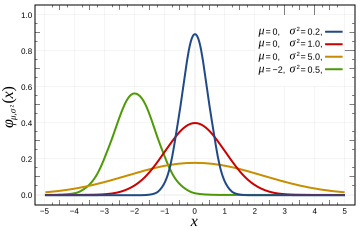
We can abstract our assessment procedures into some kind of statistical goo if we imagine that the test subject has some intrinsic ability to successfully complete the task at hand, but that this ability is perhaps occluded by noise or error of various sorts. Under the right probabilistic assumptions, we can then imagine that we are estimating this parameter--this ability to ace our assessment task. Typically this assessment will itself be a statistical melange of tasks that have different qualities. A spelling test, for example, could have a staggering variety of words on it in English. If there are a million words in the language, then the number of ten-item spelling tests is about
10,00,000,000,000,000,000,000,000,000,000
,000,000,000,000,000,000,000,000,000,000.
So the learning outcomes question "can Stanislav spell?" depends heavily on what test we give him, if that's how we are assessing his ability. Perhaps his "true" ability (the parameter mentioned above) is the average score over all possible tests. Obviously that is somewhat impractical, since his pencil would have to move faster than the speed of light to finish within a lifetime. And this is just a simple spelling test. What are the qualitative possibilities for something complex like "effective writing" or "critical thinking?"

When we assess, we dip a little statistical ruler into a vast ocean of heaving possibilities, changing constantly as our subject's brain adapts to its environment. Even if we could find the "true" parameter we seek, it would be different tomorrow.

All of this is to say that we should be modest about what we suppose we've learned through our assessments. We are severely limited in the number of qualities (such as combinations of testable items) that we can assess. If we do our job really well, we might have a statistically sound snapshot of one moment in time: a probabilistic estimate of our subject's ability to perform on a general kind of assessment.

If we stick to that approach--a modest probabilistic one--we can claim to be in positivist territory. But the results should be reported as such, in appropriately technical language. What actually happens is that a leap is made over the divide between Ayer and Wittgenstein, and we hear things like "The seniors were measured at 3.4 on critical thinking, whereas the freshmen were at 3.1, so let's break out the bubbly." In reality, the numbers are some kind of statistical parameter estimation of unknown quality, that may or may not have anything to do with what people on the street would call critical thinking.

Note that I've only attempted to describe assessment as measurement in this installment. There are plenty of types of assessments that do not claim to be measurement, and don't have to live up to the inherent unrealistic expectations. But there are plenty of outcomes assessments that do claim to be measurements, and they get used in policy as if they really were positivist-style tick marks on a competency ruler. Administrators at the highest levels probably do not have the patience to work through for themselves the limits of testing, and may take marketing of "education measurement" at face value.

In summary, "measurement" belongs in positivist territory, and most educational outcomes assessments don't live up to that definition. Exacerbating this situation is that "critical thinking" and "effective writing" don't live in the positivist land--they are common expressions with meanings understood by the population at large (with a large degree of fuzziness). Co-opting those words borrows from the Wittgenstein world for basic meaning, and then assigns supposedly precise (Ayer) measurements. This is a rich topic, and I've glossed over some of the complexities. My answer to the question in the title is this: educational assessment is a statistical parameter estimation, but how that parameter corresponds to the physical world is uncertain, and should be interpreted with great caution, especially when using it to make predictions about general abilities.