Showing posts with label grades. Show all posts

Sunday, December 12, 2021

Are you calculating GPA wrong?

Sorry for the clickbait headline, but it's accurate: the way we assign grade points (A = 4, B = 3, etc.) is arbitrary, which makes me wonder if it's sub-optimal. That statement--GPA being sub-optimal--is a little mind-bending. What does that even mean?

We certainly treat GPA like it means something. The statistic is used as a measure of Satisfactory Academic Progress (SAP), which has the weight of federal regulation behind it (34 CFR § 668.34). The regulation doesn't specify how GPA is to be calculated, however (or even that GPA must be the measure of progress).

Student grade averages are also used to determine financial aid, program admittance, and create informal barriers to experiences like study abroad and internships. Employers may use GPA as a filter for screening applicants.

Such uses suggest a measurement study, where we work backwards from the uses of GPA to assess the predictive validity and other measurement properties. For example, if employers are using GPA > 3.0 as a screen, is that meaningful for students from a particular institution/program? Is it valid across institutions? Such studies are routinely done by institutional researchers, for example in using GPA to predict retention, but this probably doesn't often include alternative definitions of GPA.

I'll take a different approach here, to focus on a single measurement question that may seem abstruse: the existence of a latent variable.

Latent Traits

Imagine that GPA estimates some student trait on a numerical scale. I won't focus on what the scale measures, but rather how we expect those values to be distributed. If we imagine that we've tapped into a latent variable that is the result of the contributions of many factors, then it is reasonable to assume by the Central Limit Theorem that the distribution of values is normal (the bell curve common to statistics). 

With the assumption that GPA should be a normal distribution, we can ask the

research question: what is the grade-point assignment that gives the best approximation of a normal GPA distribution?

Instead of assuming that a B is 3 grade points for GPA purposes, maybe the "best" value is 2.9 or 3.5, where "best" means the value that leads most closely to a normal distribution of values. 

The simplest way to induce grade point values is to use the ideas I wrote about here, here, and here.

Figure 1. Assuming a log-likelihood latent scale for course grades, and that the scale is normally distributed, red lines denote induced scalar values on the 0-4 grade point scale, where 4 = A, 3 = B, etc.

In this method, the lowest (F = 0) and highest (A = 4) values are fixed, and the intermediate ones are allowed to vary. The results are D = 0.8, C = 1.6 , and B = 2.7. One can see in Figure 1 that the gap between the induced values (red lines) is larger between A and B than the others, suggesting the need for a "super-A." At my institution, the A+ grade is four grade points, just like a regular A. Imagine that we let A+ = 5 instead. Then the induced scale shifts the undecorated A to the left.

Figure 2. A+ grades are assigned five points in this variation. The induced values are F = 0, D = 0.7, C = 1.5, B = 2.4, and A = 3.5. On a four-point scale it's equivalent to F = 0, D = 0.6, C = 1.2, B = 1.9, A = 2.8, and A+ = 4.

Notice the large gap in Figure 2 between A+ and A grades. The A+ version emphasizes the need for a grade to the right of A to better calibrate GPA. Alternatively, grading styles could be recalibrated on the usual scale by pushing the distribution leftward (more difficult-to-earn grades, making As less frequent).

Course Difficulty

There's a problem with the analysis above. The Central Limit Theorem that guarantees a normal distribution is fueled by independent samples, and the courses students take (hence grades) are not randomly selected in most cases. Some courses are more difficult to earn grades in than others, and students can pick their way through these in many different ways. We can't make the selections random, but we can try to account for the variance in course difficulty. There are multiple ways to do that, and I'll just describe one here.

For each student and each course section, count up the A-F grades assigned, and then compute the proportions of each grade type assigned for (1) each student, and (2) all the sections that student was in, combined.
 
Table 1. R output showing student statistics, one row per student. The S_ columns are frequencies of grades in the courses that student took, and the plain A-F grades are the proportions for that student.

 
In the first row of Table 1, that student took classes where 49% of the grades assigned were As, but the student's A-rate is 85%, far above expectations. By contrast, the third student's A-rate (37%) is close to the expected value for the courses (36%). 
 
With the grade proportions calculated, any grade point assignment, like A = 4, B = 3.4, C = 2.5, D = 2, F = 0, can be used to calculate a GPA for the student and for the sections of courses they took. If we subtract these (student GPA - courses GPA), we get a relative GPA that attempts to subtract out course difficulty. Then we can try out various point assignments to see what the distribution of this relative GPA looks like.
 
Claim 1: Any linear assignment of grade point weights results in the same distribution of GPA. 
 
I discovered this while trying out different weights. <edit> Here's the proof outline. Imagine that we start with the usual 0,1,2,3,4 weights, and they give us a distribution of GPAs. If we add a constant c to get weights c,1+c, 2+c, ..., this will move the distribution to the right, but won't change its shape. Therefore, we can assume without loss of generality that the F weight is zero. Now imagine multiplying all the weights by c to get 0, c, 2c,... . This will increase the span (standard deviation) of the distribution, but won't change the shape after it's divided by its standard deviation. So any linear transformation of the usual 0,1,... weights give us the same type of distribution (normal or not). Therefore any weights  \( w_i = a + bi \) preserve the distribution of GPAs after centering and scaling. A consequence is that we can always assume F = 0 and A = 4, and let the intermediate values vary without losing generality. </edit>

Given Claim 1, pinning F = 0 and A = 4 should not diminish the generality of solutions, so that's what I did.

Figure 3. Q-Q plots for (left) the usual integer (A= 4, B = 3...) weights, (middle) the optimal scale with just A, B, C, D, and F, and (right) the optimal scale including A+.

To assess different weights, I computed the sum of the squared difference between the cumulative distribution of GPAs and that of the normal distribution for each sample point. An optimization engine then tries out different combinations of weights to find the optimal one. These can be visually assessed using a Q-Q plot, where the empirical distribution is plotted in black and the red line is the ideal distribution. The three versions plotted in Figure 3 show that the usual integer weights don't give terrible results. Shifting the weights to A = 4, B = 3.25, C =  3.04, D =  2.80, and F = 0 improves the middle of the distribution (OptimalA), but there's still some divergence at the upper end. That's where adding the A+ as a separate grade helps. That version (OptimalA+) is nearly perfectly normal. The weights for that one are shown in Figure 4.


Figure 4. A visualization of the extended grade weights to produce a near-perfect normal distribution of grade averages. The black line is the usual integer scale, with vertical displacements of the labels to show differences.

Given Claim 1, the improvement in the GPA distribution's shape to near-normality is the result of the non-linear displacements (grades higher or lower than the dark line in Figure 4) and the addition of the A+ as a separate grade.

The optimization engine is sensitive to the initial guess for the parameters, and can converge to local minima that are not very good. The initial parameters for the output in Figure 4 were D = C = B = A = 3 points.

Discussion

The weights in Figure 4 suggest the need to weight A+ grades differently than A grades. The gaps between A, B, and C are nearly equal, and since these are the most numerous grades, this explains why the usual 0 to four scale has a nearly normal distribution. The results suggest that there's not much difference between C and D grades, however. 

Results from the difficulty-adjusted weights in Figure 4 compare favorably to the latent-variable approach in Figure 2:

Difficulty-adjusted:

F = 0, D = 1.2, C = 1.3, B = 1.9, A = 2.6, and A+ = 4.

Latent Scale:

F = 0, D = 0.6, C = 1.2, B = 1.9, A = 2.8, and A+ = 4.

The only significant difference between the two is the weight for the D grade.

This analysis is predicated on the assumption that student abilities measured by GPA should be normally distributed. There are usually selection effects during the admissions process that could challenge the symmetric distribution theory. However, the similarity of the integer-weighted GPA to a normal distribution is close enough to think it's a reasonable assumption. Additionally, the fact that the optimal grade points end up in the right order (A > B, etc.) is a sign of validity.

Source Code

You can find the R code for the A+ version of the difficulty-adjusted weights on github here.
 

Predictive Validity

[Added 12/17/2021] I tried the different GPA scales as a predictor of success, using admittance to graduate school as the measure, because it's a high bar. The outcome data comes from the National Student Clearinghouse.

Figure 5. Smoothed rates of graduate school admittance by GPA metric over about 8000 students sorted from low to high. GPA = the usual GPA, wGPA is the usual weights after accounting for course difficulty, and wpGPA is the custom difficulty-adjusted weights found in the Discussion. 
 
The squiggles in the canon GPA seen in Figure 5 are an artifact of having few unique outcomes. The shape of that red line is due to the interpolating function attempting to fit a polynomial through points, and should not be taken as a continuous response. I left it that way as a warning against over-interpreting such curves.
 
Both difficulty-adjusted GPAs generate more unique values and are more amenable to this sort of averaging. The two curves are virtually identical, suggesting that changing the weights to make the distribution near-normal doesn't affect their utility much. Both are superior to the unweighted GPA if only because we have finer distinctions.
 
The re-weighting of GPA is a cute example of optimization, but it isn't worth the time for predicting this outcome. I also found no difference in predicting undergraduate graduation rates. 

The overall shape of the curves in Figure 5 suggest two selection effects based on GPA: one by the student, who chooses to apply to graduate school or not, and one by the graduate schools in admitting applicants. The relationship between GPA and graduate school attendance is approximately piece-wise linear with a break at around 25%. A potential second break near the top of the scale is interesting, suggesting that some of the most academically qualified students don't apply to graduate or professional school.


Friday, November 15, 2019

Remaking Grades

Introduction

This is a useful trick I learned a couple of years ago, for working with course grades. The distribution of raw grades is usually censored (i.e. clipped) at the top end. This happens if admissions standards and grading standards are such that a large fraction of students will succeed in the classroom (receive As). The trick is to recalculate grades to get more information out of them.

Method

Statistically, it's annoying to have a truncated distribution as an outcome variable, but there's a way out of it. If we assume that it's harder to earn an A in some classes than others, then we can do the following to estimate course section difficulty:

  • Assume that a students total cumulative GPA is a reasonable measure of academic ability A.
  • Within a given course section, the expected GPA of all students receiving a grade would be the average ability of those student: \(E(A)\). That is, we just find the cumulative GPA for each student, then average those to get an expected GPA for the class.
  • A given class's "grade difficulty" is \( E(A) - GPA_{class} \). In other words, we subtract the actual grade average of the class from the expected average. If this is less than zero, that means the assigned grades were higher than expected, so the difficulty is lower than average. 
That method allows us to recalculate grade averages for course sections, if we want to do a section analysis, or see if one subject is more difficult than another subject.

To work with individual student grades, e.g. to predict first-year grades as part of an intervention program, we can recalculate them in a similar way.
  • For each class, calculate the average grade assigned \( GPA_{class} \).
  • Subtract it from each student's grade in that course: \( GPA_{student} - GPA_{class} \). If this is greater than zero, the student out-earned other students in the class on average. 
  • Average each of those differences for every student to get a new estimate of A. It's a difference between grades. If you want to recast it as a kind of GPA, add the average grade over all classes and students. 

Results


Figure 1. The effect of recalculating student grades by the difference method.


The distributions in the figure show the effect of the second method: recalculating student grades based on course difficulty. Applying this calculation before doing a regression analysis helps get better estimates of A and increases the explanatory power of the model.

Discussion

In R you can simultaneously calculate section difficulty and student grade-earning ability using a random effects models. Some statisticians I compare notes with don't bother to do this, but it's an option if you have time for the model to run (it can take a while with a lot of data).

I use library(lme4) to access the lmer package, and use a formula like

Points ~ 0 + (1|StudentID) + (1|SectionID)

This returns a model with all the random effects, which are estimates for each student and class. For the students it's a difference score that estimates grade-earning ability, with a distribution like the one in figure 1. For classes it's a recalculated grade average that can be used to identify course or subject difficulty. 


Thursday, November 14, 2019

Grade Consistency within Subjects

Introduction

A few days ago I posted graphs comparing within-subject grade agreement to between-subject agreement. This article improves on that idea. Since grades are capped (for us) at A = 4 points are skewed toward the high end, subjects that grant higher grades on average will generally show more agreement.

In other words, to really understand agreement, we have to take the grade average  into account. One theoretical approach is to use a kappa-type statistics that compares actual agreement to chance agreement. But these statistics are problematic and hard to explain to non-experts. Instead, we'll just consider the issue two-dimensional and look at variation and average in the same picture. The necessary input data comprises at least: StudentID, Subject, and Points, for each course you want to include, where Points is (for us) a 0-4 map to letter grades A,B,...,F with A = 4.0.

Implementation Code


Here's the function.
#' Calculate subject grade variation
#' @description Given a set of grade data, find the average variation in assigned grades 
#' to individual students who take multiple courses in a subject.  
#'
#' @param grades A dataframe with StudentID of the student, Subject code, 
#' e.g. "BIO", and Points = grade points on four-point scale
#' @param .min_classes The minimum number of classes a student needs in the subject 
#' before we include them in the statistics.#' 
#' @return A dataframe with means and standard deviations by subject
#' @export
#'
subject_grade_stats <- function(grades, .min_classes = 1){
  
  grades %>%
    group_by(Subject, StudentID) %>%
    summarize(N = n(),
              GradeSD = sd(Points, na.rm = TRUE),
              GradeMean = mean(Points, na.rm = TRUE)) %>%
    filter(N >= .min_classes) %>%
    summarize(GradeSD = weighted.mean(GradeSD,N, na.rm = TRUE),
              GradeMean = weighted.mean(GradeMean,N, na.rm = TRUE),
              NGrades = sum(N),
              NStudents = n())
  
}

This takes advantage of the conveinent way that dplyr groups data. The first summarize() ungroups the StudentID column, and the second one acts on the result, which is still grouped by Subject.

We can map the output to a plot.

Results


For the blog, I'll anonymize the subjects. The code below filters the statistics data to programs with at least 50 students in the data set and then plots average standard deviation versus average grade assigned in the subject.
library(tidyverse) # or just dplyr and ggplot2

library(ggrepel)   # optional, for avoiding overlapped labels


# get the grade stats for students with >2 courses in a subject, filter N >= 50 students

grade_stats <- subject_grade_stats(grades,3) %>% filter(NStudents >= 50 )

# anonymize for blog
grade_stats$Subject <- as.factor(grade_stats$Subject) > as.integer()
# plot standard deviation vs mean and label the subject

ggplot(grade_stats, aes(x = GradeMean, y = GradeSD, label = Subject)) +
  geom_smooth(method = "lm", se = FALSE, color = "gray", linetype = "dashed") +
  geom_label_repel() + # optional: requires library(ggrepel) 
  theme_minimal()

That produces the plot below.


As expected, the variation within the grades, measured by the average standard deviation of grades assigned to an individual student, is negatively correlated with the average grade assigned for the subject. The regression trend line (unweighted) is plotted for reference.

Subjects above the reference line show more variation than expected, meaning that students who take multiple courses within the discipline (at least three in this graph), receive more dispersed grades after accounting for the overall average. This could be because the discipline comprises different kinds of learning, or it could be because the students who enroll in that subject have more variability in their grade-earning ability, or it could be that the instructors inherently don't agree about grading practices.

In my data, there is a tendency for foreign languages to have smaller-than expected variation in grades assigned. The Art grade averages fall near the middle and show greater variation than the trend line, which is to be expected: art history is very different from design, which is very different from media skills like pottery or photography.

Two of the subjects, located at #8 and #20 have significantly different statistics that similar disciplines. One of these was the subject I identified in the prior post as an outlier.

Discussion

The assessment of grade reliability presented here is simple and (I think) easily explained. I like it better than my first attempt, although the graphs were prettier in that version. What's missing here is the additional validation obtained by comparing within-subject grades to between-subject grades. My method for doing that in the other analysis was to create all the combinations of classes between two subjects. For example, if a student took three BIO courses and two CHM courses, the number of unique combinations is an outer product: six of them in the example. This is probably not the best way to proceed, and something more like an ANOVA may be smarter.

Sunday, November 10, 2019

Delay Time Code and Example

Introduction

Last time I sketched a research idea to examine the link between when students take a course and their grades in the course. This is particularly applicable to gateway-type courses either in general education or in popular majors. This time I'll show show some code and talk about real results.

I haven't found a great way to embed code, so I used images. I apologize for that, but this isn't really copy/paste-able anyway, due to the customization to our specific circumstances. 

Getting the Data

In my experience, getting data and preparing it for analysis is time-consuming. In the old days of Excel and SPSS, it was prohibitive. I remember printing out multi-sheet correlation tables, taping them to the wall in a big grid, and manually highlighting them. Or importing CSV files into Access so I could run SQL queries to join them. Thankfully, those days are over.

We've spent a lot of effort to streamline data access so we can spend more time doing statistics. All the data comes from our IR data warehouse, and we use R's library(odbc) with library(tidyverse) to accomplish the rest. This just requires setting up a local ODBC connector on your machine. Once the connection (called dbc for database connector) is in place, getting data is easy.

Lines 1-7 below join the CourseEnroll table with the CourseSections table. The first has grades for each student, keyed by a SectionID, adn the second has information about that course. Specifically we want the subject code and number, e.g. BIO 101.


The select statement is actually a dplyr verb, not an SQL command, but it gets translated in the background to SQL to make the query. This is a huge time-saver, because I don't have to mix SQL and R code. It's also easy to read. 

By line 9, we've connected two tables and are set up to pull course names (e.g. BIO 101). Lines 9-15 specify what we want to pull down from the two tables: the student ID, the term the course was taken, the letter grade, the course points and credits, and the subject and number of the course. 

I decided to ignore withdrawals, although that might be interesting to study too. So lines 17-19 filter the data to courses with credit that have an A-F grade, and are relatively recent. 

The collect() verb tells R to pull all this down from the database. So in the background all the code in lines 1-19 gets translated into one big SQL statement, which is now executed. 


Lines 23-24 go back to the database using a convenience function we have in a custom package, to retrieve all students who are in our official first-time full-time freshmen cohorts. Since we want to understand sequential course-taking, it makes sense to exclude transfers and other sorts of students.

The most recent returning class (entering fall 2017) hasn't had two full years yet, so I excluded those in line 25. That leaves us cohorts 2012 through 2016 as data points.

Line 27 uses another custom function to add the start term to each student record. This is inefficient computationally, but easy to add here since I had the function handy. The start terms should all be the fall of their cohort year, and that would be another way to do it, using mutate() and paste().

Now we need to tweak the data a little.


The mutate() verb in dplyr lets you create new columns or change existing ones. Here, I use a custom function to compare the term each course was taken with the student's start term to find the time elapsed. This returns a number 1,2,3..., where 1 means first fall/spring term attended, and so on. There are a very few odd cases where it might turn out to be zero, so I round those up in line 30. 

We want to study courses taken early in a student's career, so any terms after 6 (end of junior year) I round down to 6. There aren't many cases like that, and it cleans up cluttered cases with small Ns.

Line 32 fixes a change in course prefixes that happened a couple of years ago, to make them match across time. 

Line 33 creates a Course variable by combining the subject and number, e.g. "BIO" and "101" turn into "BIO 101".

Finally, line 34 calculates the grade points assigned, where 4.0 = A, 3.0 = B, etc. 


Lines 36-38 look at the admissions data table and retrieve high school grade averages, which have been recalculated to be on a common 4-point scale. 

In the pre-R days, this data assembly probably would have taken me half a day. Now it just takes as long as writing the description and fixing typos and logical errors. Most importantly, the process is standardized and transparent. It runs in a few seconds, even through VPN. 

The result is about 57,000 data points, illustrating the comparison with formal assessment data. As someone once said, quantity has a quality of its own. 

The Research Data

Now that we have courses and grades, coupled with when students took the courses and their high school grades (to use as a predictor), we can narrow the data down to the courses that are the focus of the research. In this instance we only care about courses that are commonly taken by students in their first two years of college.


The filter in line 42 says we only care about the first two years. The next line counts total enrollment for each course and calls that count N_enroll. Line 44 sorts the list so it's easy to scan when printed out, and line 45 filters courses to those with at least 200 students enrolled. That list of courses is saved in a new data frame called popular_courses.

Lines 47-48 inner join the popular courses with the grades data, meaning only the courses in the former are now in the data set: 37 courses and 18,000 data points.

Correlations 

The first scan looks at the linear correlation between when a course was taken (a term number 1-6) and the grade points (0-4.0) for each student who took the course. This entails processing through each course, sub-setting those data points, computing correlations, and then assembling then. Again, this would have take me hours in the old days. Now it's just this:

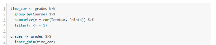
The script I'm using starts renumbering back at 1 for technical reasons. Lines 1-4 consider the data as grouped by Course, and for each one computes the correlation and stores it in a new variable r. Because we're interested in negative correlations (waiting to take the course associates with lower GPAs), I've filtered to correlations of -.1 or lower. 

Lines 6-7 filter our grade data to just these courses. Now there are seven courses and 3200 data points. Here are the results:


In posting this publicly, I've made the course names generic. They are all STEM or foreign language courses in this case.

Visualization

It's always a good idea to look at the data. Here are the per-term grade averages for the selected courses.

Figure 1. Grade averages by term taken.

I left off the error bars because they cluttered it up. In my first article, I suggested using the year the student took the class, but it's clear here that it's better to use the term number.

Notice the steep decline in Course 8 (pink) over three years. Some of the others, like Course 21 (red) have low GPAs, but they are consistently low.

Models

We've now identified some courses where waiting to take them might be detrimental to the student. Another possibility is that the students who wait to take these courses are less-prepared academically. To attempt to disambiguate the waiting effect from the selection effect, we can create a linear model for each course. The dependent variable is average GPA in the course, and the dependent variable is the time the course was taken (TermNum) and the high school grade average (HSGPA). 

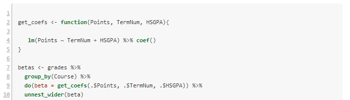
Once again we have the challenge of looping over each subject and doing complex calculations, then assembling the results. The tidyverse R packages makes this easy.


Lines 2-5 define a convenience function to build the requested linear model and extract its coefficients. Then we loop over each course with lines 7-8. Line 9 does the work of getting the coefficients. There are three of these, and the do() verb puts them in a list. The last line unpacks the list and turns them into three separate columns.


Notice that of the courses in the selection, number 8 still has a quite significant drop per term in GPA, even after factoring out high school grade averages.

The model for Course 8 has \(R^2 = .13\), which is similar to the correlation coefficient we got earlier (the square root of .13 is .36). It's small but not meaningless. Here are the model details.


Discussion

In the case of Course 8, it is usually taken in the second year, and the effect we see is mostly the difference between years two and three. On the graph, the high numbers for terms 1 and 2 are almost certainly a selection effect--only stellar students take the course that early. The year 2-3 drop raises interesting questions about advising, placement, and preparation. It would be a good idea to redo the analysis using first year college grades rather than high school grades, to see how much effect remains. 

Some of the other courses are worth following up with as well. I didn't include details of each in order to save space here. All in all, this is a successful bit of research that can help specific programs tune their student success pathways. 

If you try this method at your institution and find something interesting, please let me know.

I've had several people ask me for the code to do the grade reliability calculations. It needs some cleaning up before I can post it, but I will try to get it done this week. I want to build the functionality into our custom packages so I easily rerun it, and that takes a little longer than a one-off. 

Saturday, November 09, 2019

Using Grade Data for Improvement

Introduction

This article follows the theme of the last one, in taking a close look at course grade data and what it can tell us about student learning and success in college. I'll use a real example that you can replicate with your data and probably learn something useful.

You may be familiar with the idea of institutional effectiveness (IE), which advertises a decision-making process that comprises:
  1. setting goals relative to metrics,
  2. measuring suitable indicators of success,
  3. analyzing the data, and
  4. taking appropriate action.
I have gradually picked up on a pattern in human affairs that should have been obvious long ago: institutions choose the most convenient solutions to problems up to the point where being wrong is too painful (a less quotable version of Menchen's "there is always a well-known solution to every human problem—neat, plausible, and wrong"). 

Anne Applebaum's Red Famine describes how Bolshevik ideology led to collective farms, and kept the policies in place long after it was obvious that it was counterproductive. Luke Dittrich's Patient H.M. chronicles how many years it took to convince psycho-surgeons that they shouldn't routinely lobotomize their patients. And Siddhartha Mukherjee's The Emperor of  All Maladies describes how hard it was to uproot an erroneous theory about cancer to prevent the harm it was causing in radical surgery. 

The attraction of a good story dressed up as a theory is perhaps humanity's Achilles' heal. In the case of IE, there are several problems with the theory. This will all matter in a minute, so bear with me.

Analyzing Data

A couple of years ago I was preparing graphs of learning outcome ratings for departments like the one below, which I turned into a presentation slide.

Figure 1. Success rates in general education foreign language.


The graph is typical of what's seen in assessment reports, in alignment with the IE philosophy. Our nominal goal for general education outcomes like this was to have the "Doesn't meet expectations" rate under 10%. This one's too high by that standard. 

The problem is that, assuming we trust the data, we still don't know why students are not measuring up; we lack a causal model to explain the data. The usual advice from people who call themselves assessment experts is to extend the IE reductionism to look more closely at the work students are producing. This is one of those too-simple ideas, because it assumes that all learning problems are granular--that there's some subset of the material that is the problem, and if we just "add more problems to the syllabus" on that topic, we'll fix it. This constitutes the majority assessment "actions for improvement" that I see. 

Reality is more complicated than that. Quite by accident I made the graph below while mass-producing these for all our outcomes. Most are developmental, meaning we expect to see growth over four years, so for a threshold scale [doesn't meet/meets expectations], it isn't obviously useful to disaggregate the data by the student's year in college. 

Average success rates by when students take the course.

However, when we plot the rating averages this way, it's interesting. It looks like students who wait to take the introductory foreign language courses don't do as well in them. Is this because of the waiting time or a selection effect, where lesser-prepared students put off a hard class? A regression analysis suggests that both of these factors are involved. 

Grade Analysis

After I found the result above, it occurred to me that I could probably find the same pattern by looking at course grades, which I have a lot more of than assessment data. The analysis went like this:
  1. Get course grade data for the last several years and create a column that joins the subject and number, e.g. "Bio 101". We want grade points, not letters. You can either drop the Ws or turn them into zeros, as you like.
  2. Get a list of entering freshman cohorts and inner join to the grade data (i.e. keep only entering freshmen, because transfers will muddy the waters). 
  3. Identify the 100 or so most common courses taken and filter the data to those. These will include common general education courses and gateways for big majors. A big school would need more than 100 here, probably, to be sure to get everything interesting.
  4. For each of those courses, use the entering date of each student to add a column to the data that tells us what year in college he or she took each course. Our data columns now look like Course Type, StudentID, GradePoints, YearTaken. 
  5. For each course type, correlate GradePoints with YearTaken. (Alternatively, subtract the averages of year 1 grades from years 2+ average grades).
  6. Sort by largest negative correlations (or differences). 
When I did this, I got a list of courses that had math and sciences and foreign languages at the top. To take the next step, create linear models for each of these that has GradePoints as the dependent variable and YearTaken and High School GPA (or some other academic predictor like SAT/ACT) as independent variables. This should help sort out the selection question. 

Note: I am recoding this analysis for my data now, to organize the functionality into a reproducible research format. When I'm finished, I'll post the package on github so you can modify it for your own use. I'll post an update when that's done.

Getting to Action

My conclusion of the analysis on grades was that different advising could raise grades in the courses identified by getting students into them sooner. Notice that this is a long way from "adding another problem set on subject-verb agreement," which would be a likely outcome of only having figure 1 to consider. 

It seems very rare in institutional research to actually find a problem that can be clearly linked to a likely solution. When it does happen, the follow-up can be discouraging, because it's hard to change things. Machiavelli said it best in The Prince:

It ought to be remembered that there is nothing more difficult to take in hand, more perilous to conduct, or more uncertain in its success, than to take the lead in the introduction of a new order of things. Because the innovator has for enemies all those who have done well under the old conditions, and lukewarm defenders in those who may do well under the new. This coolness arises partly from fear of the opponents, who have the laws on their side, and partly from the incredulity of men, who do not readily believe in new things until they have had a long experience of them.
In this case, the solution is complicated, because it's not really just about advising. It's also about course capacity and agency of students. It's about institutional culture. 

My guess is that if you do this analysis yourself, you'll get similar findings. If you can then implement changes so that the most vulnerable students get into the risky classes earlier, with proper support, it could lift success rates, and--incidentally--additional revenue via retention. 

Discussion

The IE model has two simplifications illuminated in this article, that create critical weaknesses in the usefulness of the theory. The first is the implicit idea that just having some data is enough to identify a way to improve your situation. In reality, we have to have a way to use the data to predict what will happen in the future--a predictive model. That's difficult and often impossible, when we just don't know enough about the domain, or it's inherently random  (e.g. predicting the stock market is difficult despite all the data available, and weather forecasts more than a few days out are useless). 

The other oversimplification is the idea that people make data-driven decisions. Says Cassie Kozyrkov at Google "Businesses hire data scientists in droves to make rigorous, scientific, unbiased, data-driven decisions. And then they don't." This is one of several articles I've come across attempting to explain why data science often doesn't lead to different decision-making. It's a human problem, involving leadership style, psychology, and institutional culture. Stalin knew collectivization was leading to mass starvation, but the program was too associated with him to reverse. 

Some problems that Kozyrkov observes:
  • Many people only use data to feel better about decisions they’ve already made.
  • The more ways there are to slice the data, the more your analysis is a breeding ground for confirmation bias.
  • When decision-makers lack fundamental skills, there’s no math in the world that can fix it.
Another take on the same problem is found in an article by Jan Bosch here:
  • bad data,
  • wrong interpretation,
  • confirmation bias,
  • and the opposite: rejecting data that discredits a pet theory.
Jan closes with a subtle problem stemming from too much ambition, political necessity, and statistics:
Finally, when a company starts with a data-driven initiative, the initial focus is on a big, strategically important topic that has many contributing variables. The topic is selected in order to garner the necessary support. However, the first initiatives to use data with the intent to influence the strategic goal have too little power to move the needle on the measured output data. The effect of the input variables is too little to push the output variables outside the noise range. Therefore, the initiative is easily categorized as a failure as the effects were too small to influence the selected output variable with statistical significance. In effect, the initiative was set up for failure from the beginning.
In statistics, we do (or should do) a power analysis in the beginning, to see if the proposed data have enough statistical usefulness to give us an answer to the research question. Otherwise, we can do a lot of work to gather data and then get an inconclusive result even when the thing worked.

The lesson is that if you're serious about using numbers together with goals, the statistical models should be designed at the beginning with the metrics and goals. 

Which brings us to the most significant problem with the IE theory that I'll mention: many problems can't realistically be solved via statistical modeling. There are other kinds of leadership that are just as important, and the most effective leaders are those who can make good decisions with only poor information. How that's possible will have to wait for another day.

Friday, November 08, 2019

Course Grades as Data

Introduction

To borrow a phrase from John Barth, within assessment circles there is a pernicious enthymeme that grades don't matter. Course grades are discounted outright as useful data about learning, or they are relegated to the purgatory of "indirect evidence." This ban is one of the data purity rules that also excludes surveys and really anything that is not:

  • tied to a specific piece of students work, and
  • classified by grading, rubric, etc. in an approved manner. 
This is a standardized testing approach that retains only part of the standardization: (1) common point-in-time student work, and (2) a similar-looking rating method. I say "similar-looking," because a real standardized approach would evaluate reliability to ensure that the ratings have some statistical stability. This is rarely done in assessment practice. If it were done, it would reveal that the reliability is quite low most of the time.

There are standard rhetorical objections to using grades, such as (1) lack of specificity in what kind of learning is being measured, (2) confounding of  learning with, e.g. effort, and (3) low reliability due to non-standard grading practices. These are rhetorical objections, not empirical ones. The assessment community seems to be largely allergic to using data to support claims like this. The objection about reliability is particularly ironic, given the low reliability of the data in common use, like papers regraded with rubrics.

The purpose of this post is to explore some of the ways in which grades are useful in understanding learning, including how grades analysis can lead to improvements in programs and practices. 

Data Qualities

First, let's take an inventory of what we have. It's useful to compare the usual data from program assessments to course grades.
  • Assessment data
    • many small sets of unique data types
    • large variation in how the classifications of student work were made
    • large variation in the nominal encodings of the classifications (e.g. test scores, rubric ratings, etc.)
    • usually anonymous (not tied to student ID)
    • often gathered only in upper-level courses, maybe only in a capstone experience
  • Course grades
    • large historical set of records stretching back years
    • large variation in how classifications were made (different grading practices)
    • common scoring encodings: usually A,B,C, etc.
    • grades are linked to student IDs, so they can be studied in context
    • grades are captured during a students' entire history, including transfer-in credit
To put some numbers on this, a hypothetical college with 5000 students, where students take 10 courses per year on average, will generate 50,000 data points per year via course grades. The same college may have 100 academic programs, each with (optimistically) five stated learning outcomes. Nationally, the median program size (by graduates per year) is 11, after dropping the zeros--so this rounding up. If all 11 are assessed on all five outcomes, we have annually*:
  • 100 x 5 = 500 individual data types that cannot realistically be aggregated for statistical purposes, generating
  • 5,500 data points per year, unlinked to other aspects of student demographics or histories.
So in the absolute best case, where every program assesses every outcome all the time, we still only have 10% of the data that grades are giving us, and moreover the individual pools of data from assessment are impossible to analyze comprehensively; we're stuck with small samples, analyzed in a hurry (we have 500 of them!), with poor controls on quality, if there are any at all. 

The last bullet points in the parallel lists above are particularly important. Most assessment programs can't tell us anything about why students don't complete, because they are focused on the end product. Students who drop out along they way are--astonishingly--invisible to the usual assessment methods.

With this perspective, we'd be foolish to ignore grades as data. In fact, we should begin with grades since they are freely available. 

*this implies that about 1000/5000 students graduate per year, a reasonable figure for a selective institution. 

Research Questions

What kinds of questions might course grades answer? Here are a few.
  • What predicts academic success in gateway courses?
  • What is the effect of grades on persistence in a subject, e.g. becoming a major or not, graduating in that major or not?
  • How reliable are grades at the institution? Within each major?
  • How are grades related to other data on learning?
  • Can we detect broad learning types through analysis of grades? For example, can we distinguish humanities-types skill from math-type skill from others?
  • How well do grades predict student retention to graduation?
  • Are high/low grades associated with a sense of belonging at the institution?
I'll address most of these over the next few articles. Let me start at the beginning, with reliability. If grades have too much unexplained variance, then there isn't much we can do with them.

Reliability

Here's an easy check you can do at your institution. For the most recent three or four graduating classes, get:
  • each graduate's student ID and first year GPA (FYGPA), and
  • each graduate's student ID and GPA for courses taken after the first year (SYGPA).
Join these two by the ID to get columns (ID, FYGPA, SYGPA). Compute the correlation of the latter two columns. At my institution, it's .79. This is a pretty high number, indicating that there is stability over time in grade averages per student. It's a simple measure of reliability that's easy to explain to others. This is an important fact to know, because it implies that there is a student trait we might call Academic Ability, and that it's persistent over time. This might lead us to conclude that we should account for academic ability when we examine any type of learning data, like discipline assessment data. Even if we have good data for the program, if we don't take into account the types of students in that program, we won't get the full picture of what's going on.

A more involved calculation lets us compare reliability within and between disciplines. Here we correlate lists of courses by subject code, e.g. Biology course grades correlated with Chemistry grades. We would expect to see patterns, like:
  • Grades within a single subject (e.g. Biology 101 to Biology 102) would be expected to have higher reliability than between disciplines (e.g. Biology 101 to English 101).
  • Disciplines with more regimented subject matter would be expected to have higher reliability, e.g. foreign languages and math would be expected to have higher internal correlations than history and art, because of the less structured curricula in the latter (depending on local curriculum design, of course).

Figure 1. Internal (red) and between-subject (gray) correlations of course grades by subject. The subject names are redacted.


The original plot has markers on the horizontal axis to tell us which academic program is represented on that vertical line. I left those off for this post. The red dots in figure 1 show the internal reliability of course grades, measured by Pearson correlation. This is a fairly crude way to do this, but straightforward to calculate. The gray dots are the correlations for that discipline and some other discipline. 

The general pattern is that, as expected, highly-structured curricula have higher internal reliability. Since the red dots appear mostly above the gray dots, we can conclude that within-discipline reliability is generally higher than between-discipline reliability. This in turn implies that different types of learning are occurring--something that I'll come back to in a moment.

The point circled in orange is an outlier. It is a subject with a highly-structured curriculum, but with grade reliability that appears too low. This is an example of how analysis of grades can scan the curriculum and narrow in on a possible improvement. 

Means and Variances

Correlations between grades are constrained by the average grade assigned because of ceiling effects. A nice complement to the previous graph is one that shows means and standard deviations of grades within each subject. 

Figure 2. Subject mean grades and standard deviations, annotated with internal consistency relative to the average. 

The graph shows individual disciplines by their means and standard deviations, with the internal correlations plotted as a difference from the average. Notice that the subjects with negative numbers (lower than average internal consistency) tend to have higher grades. The outlier is identified in the orange box, indicating that part of the issue is that the grades are probably too high in comparison to similar disciplines.

Inducing Learning Outcomes

The correlations between subject grades can be visualized in a network graph. The graph you get depends on how the thresholds are set (low threshold = many connections). Generally, academic ability drives most of the variation in grades, but after we factor that out, discipline effects become visible.
Figure 3. Visualization of course grade correlations between subjects. 


The network shows that mathematics and history arguable comprise two distinct skill sets that are generally useful to other disciplines. We could add Arts, which I left off here-it's not strongly connected with any of these listed. 

This quick analysis produced a university-wide map of learning outcomes from course grade data. With this basis for understanding, we can take the analysis even further, which I'll show next time.


Summary


We're only getting started here, but it should already be obvious that course grade data, far from being irrelevant to understanding student learning, is an essential data source. The rhetorical devices that are used to justify the proscription on grades from accreditation reporting are just that: mere rhetoric. When we let the data speak for itself, the value is obvious.

I haven't posted the R code this time, because it's fairly long. Contact me if you want it.


Update: I found a pdf of Giles Goat-Boy and located the apposite quote (page 42 of the pdf):
Doubtless Max saw then as clearly as I did later the ruesome enthymeme hanging like an echo in his pause. 
So it's ruesome rather than pernicious, as I had remembered. Both work in the context of this article.

Wednesday, June 23, 2010

Proxy Problems

You may have seen this New York Times article on Loyola Law School about grades.  Quote:
The school is retroactively inflating its grades, tacking on 0.333 to every grade recorded in the last few years. The goal is to make its students look more attractive in a competitive job market.
Or from the same source, "Under Pressure, Teachers Tamper With Tests."  Quote:
The district said the educators had distributed a detailed study guide after stealing a look at the state science test by “tubing” it — squeezing a test booklet, without breaking its paper seal, to form an open tube so that questions inside could be seen and used in the guide.
Motivation?
Houston decided this year to use [standardized test] data to identify experienced teachers for dismissal
And then there's the metaphysics of time expressed with the concern "Credit Hours Should Be Worth the Cost, House Panel Members Say" in The Chronicle.
The standard of a credit hour, which is not actually a full 60 minutes in most cases, is deeply embedded in higher education as a benchmark for earning a degree. But the definition of what constitutes a credit hour has become muddled in recent years with the increase in online education.
Or an example from The People Republic of China, courtesy of  Yong Zhao at Michigan State, where standardized tests have very high stakes:
[The test] puts tremendous pressure on students, resulting in significant psychological and emotional stress. Imagine yourself as a 6th grader from poor rural village—how well you do one exam could mean bankrupt your family or lift your family out of poverty, give your parents a job in the city, and the promise of going to a great college.
About the tests themselves:
[T]he selection criterion is only test scores in a number of limited subjects (Chinese, Math, and English in most cases). Nothing else counts. As a result, all students are driven to study for the tests. As I have written elsewhere, particularly in my book Catching Up or Leading the Way, such a test-driven education system has become China’s biggest obstacle to its dream of moving away from cheap-labor-based economy to an economy fueled by innovation and creativity. The government has been struggling, through many rounds of reforms, to move away from testing and test scores, but it has achieved very little because the test scores have been accepted as the gold standard of objectivity and fairness for assessing quality of education and students (as much as everyone hates it).
Changing the topic yet again, there's a June 13th article in The Chronicle entitled "We Must Stop the Avalanche of Low-Quality Research."  The thesis is:
While brilliant and progressive research continues apace here and there, the amount of redundant, inconsequential, and outright poor research has swelled in recent decades, filling countless pages in journals and monographs.

Then there are presidential aims of doubling the number of college graduates by 2020 juxtaposed to potentially "toxic degrees" and alpine debt generated by for-profit colleges (see last post).  This tension, as well as speculation about what it means for all of higher ed is given in The Chronicle's "New Grilling of For-Profits could Turn Up the Heat for All of Higher Education."  Here's the bit where the writing on the wall appears:
Many of the issues at stake, however, could mean harsher scrutiny for all of higher education, as worries about rapidly growing costs and low-quality education in one sector could raise questions about long-accepted practices throughout higher education.
Congress and colleges still lack a firm sense of "what our higher education system is producing," said Jamie P. Merisotis, president of the Lumina Foundation for Education. "The model of higher education is starting to evolve, but it's not clear to us what that evolution looks like," he said.

If you didn't read that and say "uh-oh," take another look :-).  Here's a hint, from a May article:
The [Education] department is already working with the National Governors Association and its next chairman, West Virginia's governor, Joe Manchin III, a Democrat, to develop college-graduation-rate goals for each state and eventually, for each institution of higher education. That kind of push is necessary, Mr. Duncan said, if the country is to meet President Obama's goal for the United States to have the world's highest proportion of residents with a college degree by 2020.
What do all these have in common?  In each case, we look at one thing and imagine that it is something else.  Grades equate to academic performance, number of papers published equates to professional merit, credit-hours equates to time and effort expended in learning, standardized test score equates to academic potential for students and successful teaching for teachers, and graduation equates to (I presume) preparation for satisfying employment and a successful life. 

All of these are proxies, and they each have problems. Anyone who works in assessment is in the business of creating proxies.  They might have problems too.  Problems are created, for example, if there is economic value associated with the outcome, which is true for all of the above. Dept of Ed is willing to pay for grads?  Hey, we'll give you grads.  Here's the bill.

Other problems are related to validity; how closely does the proxy track what you're actually interested in?  Note that for true statements of fact, validity is never an issue.  If I say "35 students took the survey," and if that's true, validity is not an issue.  When I start to talk about what the survey results mean, then I have to worry about validity of statements like "students want a better salad bar in the cafeteria," or whatever.


There are some proxies that work pretty well. Money, for example.  A dollar bill is a proxy for anything you can buy for a dollar.  It's like a wild card. You'd think such a crazy idea would never work, but it mostly does.  Why?  Because it's very forcefully regulated. There's a strong incentive to go run off your own $20 bills on the color copier, but you'll end up in jail so you probably don't do that.  Where this proxy fails is where it's not tightly controlled. Like in banks, which can print their own money (for all practical purposes, this is how banks work).  If they create too much, and say cause a booming market in stuff we can't really afford, then problems occur.  Or if the government itself just starts printing the stuff wholesale. In short, if the scarcity of the proxy matches the scarcity of some set of important commodities, the buying power ought to behave itself.  (The Economist puts out a Big Mac index based on this idea of purchasing parity.)

How would you put this kind of enforcement into practice in an assessment situation? First, you have to keep people from cheating--printing their own money, so to speak.  So researchers aren't allowed to break one long paper into two in order to get more publications.  Schools can't artificially inflate grades. Colleges can't crank out graduates that didn't complete a suitable curriculum satisfactorily.  Teachers can't see the standardized test before they're supposed to.  And so on.  This may not be possible for your assessment, in which case you should probably abandon it.  Like the first example: how in the world can you keep researchers from padding their vitas?

The harder problem is validity. With dollar bills, validity is enforced by law and custom.  It says "legal tender" on the bills, and while you could barter with tomatoes instead it would become impractical.

Part of the difficulty with validity is that it changes due to the fact that a proxy has been announced to be so.  For example, if you looked back at the 17th century, it might make sense to rank researchers based on the number of their publications because they were probably not using that particular yardstick as a measure of success.  But once it's announced that papers = tenure, any validity you might have assumed before cannot still be assumed to be true.  Either economic motivation (leading to gaming the system) or lack of it (apathy and inaccurately low performance) may affect validity.

A really bad proxy can ironically bring about the opposite of what you intend.  More on that here

You would think with these problems that we would use proxies only as a last resort. But we seem to be hard-wired to want to use them.  Maybe there's some psychological reason for this.  Maybe it's part of the package for language-users. As exhibit A, I present one of the "solutions" to the posed problem of too many publications from the "low quality research" article above:
[M]ake more use of citation and journal "impact factors," from Thomson ISI. The scores measure the citation visibility of established journals and of researchers who publish in them. By that index, Nature and Science score about 30. Most major disciplinary journals, though, score 1 to 2, the vast majority score below 1, and some are hardly visible at all. If we add those scores to a researcher's publication record, the publications on a CV might look considerably different than a mere list does.
As some of the comments to this article point out, it's easier to inflate citations than it is even to crank out papers.  It's the siren song of the next, better proxy just...over...that...hill...  With a clever name like "impact factor," it must be good.

Moral: When you can, gather and analyze statements of fact about whatever it is you care about, rather than using a proxy.  More on this subject anon.

For other ideas about alternatives to grades and standardized tests, see fairtest.org, Joe Bower's blog, and Alfie Kohn's site.

Update: There's a fascinating article in Inside Higher Ed this morning called  "The White Noise of Accountability."  There are many proxies for "measuring accountability" mentioned, including this example:
The Louisiana Board of Regents, for example, will provide extra funding for institutions that increase not the percentage, but the numbers, of graduates by … allowing them to raise tuition.
The author's observation about student learning outcomes is (in my opinion) right on:
But if the issue is student learning, there is nothing wrong with -- and a good deal to be said for -- posting public examples of comprehensive examinations, summative projects, capstone course papers, etc. within the information environment, and doing so irrespective of anyone requesting such evidence of the distribution of knowledge and skills.
I interpret this as saying just publish performance information.  If we could get everyone interested in actual performance rather than proxies, we'd be a lot better off.  See "Getting Rid of Grades" for an extreme version of that idea.

The IHE article cites (and criticizes) an Education Sector report "Ready to Assemble: A Model State Higher Education Accountability System" and summarizes thus:
By the time one plows through Aldeman and Carey’s banquet, one is measuring everything that moves -- and even some things that don’t.
I took a closer look at the article to see what it says about learning outcomes--the heart of the matter. It doesn't take long to find problems:
[S]everal nonprofits have developed promising new ways to measure higher education quality that have become widely accepted and implemented by colleges and universities. The Collegiate Learning Assessment (CLA), which measures higher-order critical thinking and analytic reasoning skills, and the National Survey of Student Engagement (NSSE), which measures effective teaching practices, are two examples.
Standardized proxies.  The first one has serious validity and game theory problems (see "Questions of Validity" and  these related posts*), and the NSSE doesn't directly look at outputs at all.  There's more stuff about the CLA that looks like it came straight from the marketing department, and this assertion:
Colleges are often ranked by the academic standing of the students they enroll. But measures like the CLA allow states to hold colleges accountable for how much students learn while they’re in college.
Really?  That's a lot of faith in a proxy that doesn't even test discipline-specific material (e.g. you could ace the test and still be a lousy engineer or biologist or whatever your major was). There are other tests mentioned, but all standardized tests of general reasoning. Maybe the attraction of such things is that they give the illusion of easy answers to very difficult questions. As Yong Zhao put it in his article, describing the situation in the PRC:
The government has been struggling, through many rounds of reforms, to move away from testing and test scores, but it has achieved very little because the test scores have been accepted as the gold standard of objectivity and fairness for assessing quality of education and students (as much as everyone hates it).
The siren song goes on...

Related: "Fixing Assessment."

*These are all obviously my opinions. You can find out about the CLA yourself from their website.The test is unique and has some interesting merits as contrasted to standard fill in the bubble tests.  My point is not that the test (or other standardized tests of general knowledge) can't be used effectively, but that assuming that it's a suitable global measure for student learning at the college level is more weight than the proxy can bear. In the VSA and the "Ready to Assemble" article, the Spellings Report, and elsewhere such tests are granted status that resembles an ultimate assessment of collegiate learning, which is doesn't seem justified to me.

Tuesday, June 01, 2010

Getting Rid of Grades

Here's a thought experiment. Imagine for a moment that there were no end-of-semester grades.  No mad rush to see who graduated so we can get the diplomas right, no agonizing phone calls from tearful students about to lose their financial aid. No stress from failing too many (or too few).

Also feel free to imagine that students have to find something else to care about than the bureaucracy of hurdles and credentials that "education" has become.  Alfie Kohn writes in this article about rubrics that
[R]esearch shows three reliable effects when students are graded:  They tend to think less deeply, avoid taking risks, and lose interest in the learning itself. The ultimate goal of authentic assessment must be the elimination of grades.
In know it sounds crazy, but bear with me for a moment, because it's already being done successfully.  As I've noted before, WGU uses assessments instead of grades, but that's not what I mean.  No, I'm talking about sports.  In intercollegiate sports, student-athletes create a performance history that takes different forms, depending on the sport.  These records, videos, and other evidence show the results of performance.  Something as artificial as a grade is unnecessary.  But this is a very different model from what happens in the classroom. In business, a company is ultimately judged by its bottom line, not by its bond rating.  The value of stock shares is not based on ratings by stock-pickers but by on the number on the ticker.  In other words, actual performance is more valuable than someone's opinion about it.  

What would performance look like for academics?  I borrowed the idea the other day that understanding process is more important than looking at outcomes. It's a different, perhaps radical, departure from the way we think about classroom education.

At present, we give assignments, evaluate them according to some scale, and assign a grade.  Then that's the end of it for most assignments.  We accumulate those in some way and crank out an average to go on the grade sheet.  These document outcomes: our assessment of work done.  What would it look like to document process instead?

Before mulling that over, let's follow the rabbit further down the hole.  If students didn't have grades to worry about, what would they do?  It seems obvious that the diploma is just a "big grade" that they get at the end, so we have to get rid of that too.  Does the NBA go looking for a "certificate of participation" by the NCAA or university when recruiting a college graduate?  Somehow I doubt it.

So no grades, no diplomas, no degree programs, no graduates.  The only thing left is direct evidence of participation and performance.  This is a frightening thing from the perspective of a university administrator; half the bureaucracy just went out the window. What's left? 

Building a culture of accomplishment would take time and restructuring.  Instead of absolute ratings in the form of grades, we'd have student portfolios from the past that showcase what is possible with work and wit: not just finished products but also the process of creating them.  I gave an example the other day of what this might look like.  I assume that performance evidence would be housed in public portfolios that live in the cloud.  These portfolios would have to look different from the ones we have now.

The sole purpose of coursework would be to be to lead students to demonstrate performance.  Without grades or credentials to be a proxy between the student and potential employers (for example), only actual evidence of having accomplished something is under consideration.  In this utopia, rather than students trying to find last minute extra credit to bump their grade up, they'd be demanding opportunities to show off accomplishment.  Imagine that.

On the other hand, there are problems with this idea too.  What's to prevent someone from padding their portfolio with stuff they didn't really do?  Or simply buying a complete portfolio from a third world "portfolio farm"?  The problem, represented schematically, is
Actual -> Representation -> Observer
If there's any room to pretty up a representation, then the observer can be fooled.  It's impossible for a NCAA basketball player to fake performance because it's on TV and in official records.  So maybe the bureaucratic role of the university is simply to certify that, yes, this student really did this work, and provide context for it. In this way, the university would build up a corpus of official student accomplishment that it can show off.  Of course, that only brings other trouble.  Now it's the institutions themselves who want their product to look good, and could tilt the scales in any number of ways.  Still, this may be the best compromise. 

Then there's the problem of evaluation.  Diplomas and GPAs are easy to assess; portfolios are a big mess from a prospective employer's viewpoint.  But there's always the possibility that third-party industrial psychology types could provide search services that would ultimately be much more useful than relying on credentials and grades. 

If all this talk of change makes you grumpy, you can always go in the other direction.  Here's some advice on how to make grading even more bureaucratic.