I just finished an article Survival Strategies (pdf), which is a theoretical examination of how something--anything--can survive an indefinitely long period. There are some practical bits of wisdom to be gleaned from this for higher education or any business enterprise.
First, longevity requires one to 'be many' or 'be smart.' The former case works well for biological life, which can multiply and fill every evolutionary niche available. The latter is the only strategy open to an individual subject. It has to constantly work to increase its probability chances in two ways.
External threats and opportunities have to be anticipated in order to be successful. This means doing something like science: observation, experimentation, and creation of inductive hypotheses. The more you understand and can predict and control the environment, the better your odds are.
The second way in which an organization needs to improve its odds is internal. There is always some chance of self-destruction. For a college this might mean the decision to close the institution down because of lack of funds. It's hard to imagine an institution doing this except out of necessity, but there are other ways in which it can become self-destructive. As a case in point, this article describes a nearby college that made some bad decisions about who to let manage its endowment.
The point is that in addition to being able to anticipate and take advantage of external conditions, an institution ought to be continually striving to make its decision-making better as well. We see bits and pieces of this with an emphasis on assessment, TQM, and the whole idea of institutional effectiveness. We audit expenses assiduously. Why don't we audit decisions? If there were such a thing as documentation and retrospective analysis of decision-making, it would lead to better decisions down the road (my opinion). It's the difference between being curious and self-reflective and being stubborn and blind to the past. We would probably accept this description for individual humans, but it's not commonly discussed, in my experience, for institutions.
Update: The paper is now on the arXiv science preprint server here.
Saturday, November 29, 2008
Thursday, November 27, 2008
SAT Redux
I'm teaching an Introduction to Statistics course this term, and we just did linear regression. I used the opportunity to dig out a study of freshman grades, and showed the the students how to make a predictive model using SAT and high school GPA. The data was from several hundred students, with ACT mapped to SAT scores according to standard formulas. High school grades alone explained 33% of the variance in first year college grades in this sample. Adding SAT bumped it up to 37%. This isn't much added information, given all the trouble and expense of the SAT. Maybe it's just our type of students, but for us, it's not worth the effort. Better would be an attitude and behavior survey like the CIRP.
Tuesday, November 25, 2008
AAC&U's LEAP Initiative and Thinking Skills
If you haven't seen it yet, it's worth looking at the AAC&U's long-awaited LEAP recommendations for the liberal arts. (The link is a pdf to the executive summary). There's a lot there, but will just comment on the thinking skills part, shown below.
 Later on in the summary, they cite some statistics about what employers wish for in graduates:
 Notice anything about the two lists? The thinking skills are permuted somewhat, but they're still there. I'm interested particularly in creative and analytical thinking. In the guidelines these are combined. In the survey data, they are separated. They really should be separated in the guidelines too, because they're vastly different modes of thought. Both of the lists could use some editing. Ideally, the first two of the AAC&U's recommended list would be:
Consider. First we seek to teach students the language of our discipline, and facts about the objects they encounter. We teach them theories about these, and show them how to apply theories. This is the analytical stage of learning. Some students may do very well with this. If they have a good memory and are good at following rules, they'll be good analytical thinkers.
Then, in many disciplines there's a shift. It's subtle, but devastating to some students, particularly if they haven't been warned, or if the instructors aren't aware. We begin to expect students to apply theories to new situations, or to create their own objects and theories. We're surprised when what we see initially looks random. Student try to mimic our process, but process takes them only so far--there's something else required: the magic of the human brain in generalizing, applying inductive reasoning, and the flash of insight or just sheer audacity of thought that distinguishes the best thinkers.
Some students have this naturally--this ability to insert randomness in a controlled way to create useful novelty. Others will flail around producing garbage. It's essential that they have some mastery of the analytical rules and knowledge of the discipline, or they can't edit themselves. They don't know right from wrong, good from bad if they don't have the analytical skills.
We as instructors can prepare students for this, if we are ourselves aware of this divide. For me, it came in a class called Introduction to Analysis, where I was expected to come up with math proofs on my own for the first time. My instructor was intuitive enough to know this was a hard class, and helped us enjoy the process, difficult as it was for most. But she didn't really understand, I think, why it was difficult. It was the transition from analytical to creative thought. I know this now, and preach it to my students. I even mark problems in the homework as creative or analytical. It's an extremely useful idea for organizing courses and curricula, in my experience. We assess it too, in a gentle way that doesn't require lots of tedious bureaucracy.
So there you have it. Critical thinking, in my opinion, is some confusion of analytical and creative processes, and is not a useful dimension for a general classification of cognition. It might be a great thing to focus on in an art or performance class, as a specific skill to be developed, but not as a first tier red-letter (i.e. rubric) goal.
 Later on in the summary, they cite some statistics about what employers wish for in graduates:
 Notice anything about the two lists? The thinking skills are permuted somewhat, but they're still there. I'm interested particularly in creative and analytical thinking. In the guidelines these are combined. In the survey data, they are separated. They really should be separated in the guidelines too, because they're vastly different modes of thought. Both of the lists could use some editing. Ideally, the first two of the AAC&U's recommended list would be:
- Analytical thinking
- Creative thinking
Analytical Thinking includes knowing facts and how they relate to each other. It includes definitions and languages and rules about how they work. For example, one can imagine a field of knowledge as a semantic field over which manipulations are performed explicitly. To the extent this is true, it is an exercise in analytical thinking. Analytical thinking is algorithmic: information retrieval and manipulation. It derives from deductive reasoning: consequences follow from given rules. In math, finding the derivative of a function is an exercise in analytical thinking. Identifying a piece of music as classical is analytical. Deriving the name of an organic molecule is analytical. Determining what a computer program does is analytical. Note that the rules can become very complex, and so there's no limit to the difficulty of analytical reasoning.In summary, analytical thinking is knowing facts and applying rules. Creative thinking is creating new facts and new rules. Without a background in some body of analytical thought, it's not possible to be productively creative. This models wonderfully well the way we teach and construct curricula.
Creative Thinking is inductive or random. It looks for patterns and formulates them. It compresses complexities into simplicities, or does the opposite. It does this in the context of a body of analytical knowledge. Solving a known problem using known methods is not creative--it's analytical. Finding a new way to solve the same problem is creative.
Consider. First we seek to teach students the language of our discipline, and facts about the objects they encounter. We teach them theories about these, and show them how to apply theories. This is the analytical stage of learning. Some students may do very well with this. If they have a good memory and are good at following rules, they'll be good analytical thinkers.
Then, in many disciplines there's a shift. It's subtle, but devastating to some students, particularly if they haven't been warned, or if the instructors aren't aware. We begin to expect students to apply theories to new situations, or to create their own objects and theories. We're surprised when what we see initially looks random. Student try to mimic our process, but process takes them only so far--there's something else required: the magic of the human brain in generalizing, applying inductive reasoning, and the flash of insight or just sheer audacity of thought that distinguishes the best thinkers.
Some students have this naturally--this ability to insert randomness in a controlled way to create useful novelty. Others will flail around producing garbage. It's essential that they have some mastery of the analytical rules and knowledge of the discipline, or they can't edit themselves. They don't know right from wrong, good from bad if they don't have the analytical skills.
We as instructors can prepare students for this, if we are ourselves aware of this divide. For me, it came in a class called Introduction to Analysis, where I was expected to come up with math proofs on my own for the first time. My instructor was intuitive enough to know this was a hard class, and helped us enjoy the process, difficult as it was for most. But she didn't really understand, I think, why it was difficult. It was the transition from analytical to creative thought. I know this now, and preach it to my students. I even mark problems in the homework as creative or analytical. It's an extremely useful idea for organizing courses and curricula, in my experience. We assess it too, in a gentle way that doesn't require lots of tedious bureaucracy.
So there you have it. Critical thinking, in my opinion, is some confusion of analytical and creative processes, and is not a useful dimension for a general classification of cognition. It might be a great thing to focus on in an art or performance class, as a specific skill to be developed, but not as a first tier red-letter (i.e. rubric) goal.
Saturday, November 22, 2008
Graduation Rates by Geographical Region
I'm still working on this retention plan, supplying supporting data and statistics. My previous experiments with geo-mapping attrition weren't entirely what I was looking for. I wanted some numbers to assign. So I took a large sample of students who would have had the opportunity to graduate by now, and ran their home cities through the yahoo pipes to geotag them. Then I grabbed that information as JSON formatted data, dumped it into a text file, and used a perl script to extract lon/lat information and their ID (which I'd included). I rounded the lon/lat down to the nearest integer, and found an atlas that showed the lines.
My perl script calculates graduation rates for each of these regions. Then I tediously marked all this up in Paint (yes, I know... I do have The Gimp installed, but it didn't seem necessary) as percentages. A bit of the result is shown below.
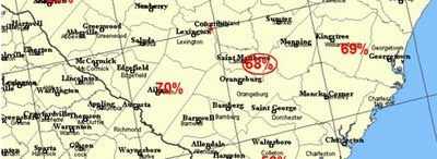 It's not shown on this snippet, but it's fairly obvious from the map that our two biggest markets could stand some improvements in the persistence department. Useful to know, and it's more quantitative that the other maps.
The Value of Retrospection
When we first started getting serious about finding the causes of retention a few years ago, we decided to implement an "assessment day" survey to gather information about behaviors and attitudes of our students. This has taken place during the last four Octobers in a specially-added class date (one extra was added to the academic calendar). Departments are encouraged to use this time to assess their programs, but IR claims the most popular time slot to administer this shot-gun survey. We get almost half the student body at 9:30 T or Th, and it's a suitable mix of classes, so that works pretty well. The instrument itself is a 100-question scantron survey of questions that were solicited from various academic and administrative units. The form has been reviewed by the IRB, and asks students for their student ID number, which most give voluntarily.
The original idea was to have some retrospective data to look at for retention purposes. It works like this. In fall 2008 we had, of course, a group of students who had attended in fall 2007 but didn't graduate and didn't return: our attrition pool. Because the survey forms are tagged by student IDs, we can look back and see what indicators there might have been. This has proven to be very useful. We have since started using the CIRP for the same purpose--and it's really been a great source of information. It's essential to get as many student IDs as possible, however. Otherwise it's much less useful because you don't know who left and who stayed without the ID.
Here's one method of mining the data. Create your database of student IDs--I'll use just 1st year students from fall 2007 here--and use the trick I outlined here to get a 0/1 computed variable called 'retain' to denote attrit/retain. Add that as a column to the CIRP data or your custom survey by connecting student IDs. You can add other information too, like athlete/non-athlete, or zip code or whatever. Load this data set into SPSS and do an ANOVA, as shown below:
 I've had issues loading directly from Excel, and usually end up saving a table as a .csv file--it seems to import better that way. You can only add 100 variables at a time, and the CIRP is longer than that, so it has to be done in chunks. Each will look something like this:
 When the results roll in, look for small numbers in the significance column. I usually use .o2 as a benchmark. Anything less than that is potentially interesting. Of course, this depends on other factors, like sample size and such.
 Now that's interesting--the ACCPT1st and CHOICE variables are very significant, meaning that they have power in distinguishing between those who returned and those students who didn't. Since I already had this data set in Access, I did a simple query and used the pivot table view to look at the CHOICE variable. For reference, the text of the survey item is:
 Students for whom the institution was their first choice were the first to leave. Not only that, but these are the majority. This turned out to be a critical piece of information. By performing another ANOVA with CHOICE as the key variable, and then using the 'Compare Means -> Means' SPSS report, we can identify particular traits of these 'First Choicers' as we have come to call them. We corraborate this with other information taken from the Assessment Day surveys, and a picture of these students emerges. I also geo-tagged their zip codes to see where they came from. More on First-Choicer characteristics will come in another post.
This was the beginning of the Plan 9 attrition effort, which is deep in the planning phase now. The bottom line is that we discovered that many of our students don't understand the product they're buying, and we don't understand them very well either. It's not the kind of thing one can slap a bandaid fix on, but will require a complete re-think of many institutional practices.
The original idea was to have some retrospective data to look at for retention purposes. It works like this. In fall 2008 we had, of course, a group of students who had attended in fall 2007 but didn't graduate and didn't return: our attrition pool. Because the survey forms are tagged by student IDs, we can look back and see what indicators there might have been. This has proven to be very useful. We have since started using the CIRP for the same purpose--and it's really been a great source of information. It's essential to get as many student IDs as possible, however. Otherwise it's much less useful because you don't know who left and who stayed without the ID.
Here's one method of mining the data. Create your database of student IDs--I'll use just 1st year students from fall 2007 here--and use the trick I outlined here to get a 0/1 computed variable called 'retain' to denote attrit/retain. Add that as a column to the CIRP data or your custom survey by connecting student IDs. You can add other information too, like athlete/non-athlete, or zip code or whatever. Load this data set into SPSS and do an ANOVA, as shown below:
 I've had issues loading directly from Excel, and usually end up saving a table as a .csv file--it seems to import better that way. You can only add 100 variables at a time, and the CIRP is longer than that, so it has to be done in chunks. Each will look something like this:
 When the results roll in, look for small numbers in the significance column. I usually use .o2 as a benchmark. Anything less than that is potentially interesting. Of course, this depends on other factors, like sample size and such.
 Now that's interesting--the ACCPT1st and CHOICE variables are very significant, meaning that they have power in distinguishing between those who returned and those students who didn't. Since I already had this data set in Access, I did a simple query and used the pivot table view to look at the CHOICE variable. For reference, the text of the survey item is:
Is this college your:Here are the results.
1=Less than third choice?
2=Third choice?
3=Second choice?
4=First choice?
 Students for whom the institution was their first choice were the first to leave. Not only that, but these are the majority. This turned out to be a critical piece of information. By performing another ANOVA with CHOICE as the key variable, and then using the 'Compare Means -> Means' SPSS report, we can identify particular traits of these 'First Choicers' as we have come to call them. We corraborate this with other information taken from the Assessment Day surveys, and a picture of these students emerges. I also geo-tagged their zip codes to see where they came from. More on First-Choicer characteristics will come in another post.
This was the beginning of the Plan 9 attrition effort, which is deep in the planning phase now. The bottom line is that we discovered that many of our students don't understand the product they're buying, and we don't understand them very well either. It's not the kind of thing one can slap a bandaid fix on, but will require a complete re-think of many institutional practices.
Friday, November 21, 2008
Targetting Aid
At the 2008 Assessment Institute I spent my time in sessions on first year seminars and retention strategies. I learned some interesting stuff. One was that at one institution where assignments were tracked, it wasn't the quality of student work that predicted retention, but the amount of it. I decided to test that at my institution by looking at our home-grown portfolio system statistics. I compared the average number of paper submissions by students who were retained to those who left for a single semester. There was no significant difference in our case.
Most strategies I saw targeted student engagement in one way or another. Activities like learning communities or work study increased the likelihood of student success. I asked questions about how retention committees worked with financial aid offices to fine tune awards. This was based on my own work here showing that grades and money are the two big predictors of attrition. No one I talked to had done such a thing, citing institutional barriers to efforts. Well, we've done it here, and had some limited success. Here's what we did.
The graph below shows the student population divided into total aid categories in increments of $3000. This is plotted against retention (dark line) for that group and (on the right scale) GPA for that group (magenta).
 It's obvious that both grades and retention increase with financial aid, which says some interesting things about they way we recruit students, grant institutional aid, and provide academic support services. Ultimately this has led to a comprehensive retention plan I called Plan 9. But what we did immediately was focus on the group of students that have a decent GPA, but are historically showing low retention. That's the group circled on the graph. We targeted these students with small extra aid awards, and saw retention for that group sore to over 80%. I did a follow-up survey of the students receiving this aid to ask if it made a difference. My response rate was low, and the results lead me to believe there were other factors at work too. Maybe we just got lucky. But the results were so good we're trying it again this year.
Plan 9 includes lots of engagement stuff, and is really a comprehensive look at retention from marketing all the way through a graduate's career. A big part of it will focus on re-engineering aid policies. It always amazes me how budget discussions in the spring focus so much attention on tuition policies, when for private colleges at least, aid policies are much more important.
Wednesday, November 19, 2008
Debating the value of SAT scores
A friend sent me a link to a New York Times article about the connection between student SAT scores and graduation rates in the SUNY system. Peter Salins, the author, poses the following question:
One question that the article doesn't answer is who exactly is graduating? Are the higher SAT scorers the ones who are responsible for the graduation rate increases? One would assume so, but it doesn't take much experience in institutional research to learn that you shouldn't assume such things. I ran our numbers to see what the situation is here. The graph below shows entering classes from 2000 to 2003 by quantized SAT, showing graduation rates. The students who didn't take the SAT (about half) graduated at the same rate as those who did, by the way.

We're a small school, so the two-standard deviation error bars are pretty intimidating, but I think we can see there's no support for the idea that the higher the SAT, the higher the graduation rate for our institution. On the other hand, actual grades earned are a good indicator. That doesn't help much for predictive purposes, but it shows that classroom accomplishments matter.
 So for us, SAT is useful as a predictor in conjunction with high school GPA for predicting first year grade averages, but not much more than that. In fact, for our student population (half are first-generation college students) there's a good chance that the SAT underestimates their potential to graduate, leading them to be 'underpriced' in the admissions market compared to schools that put more emphasis on SAT.
Ultimately, it's more important that a student and the institution be a good match than that the student has a high standardized test score. SAT is a very blunt instrument. I think few would dispute that there are correlations with grades and graduation rates that can be useful predictors, but the real question is: is it worth the cost? Are there better ways to match applicants to institutions where they may have a better chance of finding what they want. I'm convinced that in our case there is. Our recent experience with the CIRP survey has convinced me that there are important variables we're not considering when we just look at grades and test scores. Behavior, attitudes, family support, and "cultural capital" are very important. My attitude toward SAT can be summed up in a newly-minted dictionary entry: meh.
[D]o SATs predict graduation rates more accurately than high school grade-point averages? If we look merely at studies that statistically correlate SAT scores and high school grades with graduation rates, we find that, indeed, the two standards are roughly equivalent, meaning that the better that applicants do on either of these indicators the more likely they are to graduate from college. However, since students with high SAT scores tend to have better high school grade-point averages, this data doesn’t tell us which of the indicators — independent of the other — is a better predictor of college success.He explains that the admissions standards of the SUNY system in the 1990s created a natural test as some institutions raised SAT requirements while others didn't, and high school GPA requirements remained roughly the same. The former schools saw significant increases in graduation rates. He concludes that those who wish to do away with SAT requirements are ignoring important information.
One question that the article doesn't answer is who exactly is graduating? Are the higher SAT scorers the ones who are responsible for the graduation rate increases? One would assume so, but it doesn't take much experience in institutional research to learn that you shouldn't assume such things. I ran our numbers to see what the situation is here. The graph below shows entering classes from 2000 to 2003 by quantized SAT, showing graduation rates. The students who didn't take the SAT (about half) graduated at the same rate as those who did, by the way.

We're a small school, so the two-standard deviation error bars are pretty intimidating, but I think we can see there's no support for the idea that the higher the SAT, the higher the graduation rate for our institution. On the other hand, actual grades earned are a good indicator. That doesn't help much for predictive purposes, but it shows that classroom accomplishments matter.
 So for us, SAT is useful as a predictor in conjunction with high school GPA for predicting first year grade averages, but not much more than that. In fact, for our student population (half are first-generation college students) there's a good chance that the SAT underestimates their potential to graduate, leading them to be 'underpriced' in the admissions market compared to schools that put more emphasis on SAT.
Ultimately, it's more important that a student and the institution be a good match than that the student has a high standardized test score. SAT is a very blunt instrument. I think few would dispute that there are correlations with grades and graduation rates that can be useful predictors, but the real question is: is it worth the cost? Are there better ways to match applicants to institutions where they may have a better chance of finding what they want. I'm convinced that in our case there is. Our recent experience with the CIRP survey has convinced me that there are important variables we're not considering when we just look at grades and test scores. Behavior, attitudes, family support, and "cultural capital" are very important. My attitude toward SAT can be summed up in a newly-minted dictionary entry: meh.
Sunday, November 16, 2008
Dynamic Geo-Tagged Maps

Here's a cool thing you can do for free. On the left is a map of our enrolled students, tagged with credit hours. I made a similar one showing students who didn't return. The comparison shows a fairly obvious geographic concentration of attrition. More on that later. This post is about how to create one of these maps.
I found a cool demo on reddit on sending data through yahoo.pipes to google maps. It all sounded very complicated, but I thought of an interesting application one afternoon between committee meetings and tried it out. About six hours later at home I had it debugged and working. Part of the problem was the demo didn't work for me, and I had to rewrite bits. Here's how to do it.
First, you'll need an account with Yahoo. Then sign in on their überkuhl pipes constructor site pipes.yahoo.com. This utility will let you take data from one source and "pipe" it to another, with all kinds of options for filtering along the way. In this case what we want to to is take some data of interest and geo-tag it.
First create a cgi application (or get a friendly web programmer to do so) that takes some data of interest and produces a delimited text file. Here's a sample of mine:
The format is (city, state|detail information). You could include street addresses if you want. For the detail information I used number of students and average credit hours, but you could use GPA or anything you like. I used the pipe character "|" as the delimiter because the addresses have commas in them. The first row doesn't really need to be there--it just names the columns. If you don't know how to write CGI applications based on live data, you can create a static text file and slap it on the web somewhere, and that will work too. So you could take data from a spreadsheet and save it as a delimited text file, put in on your web space and proceed to the next step.Title|description
Aiken,SC|2 ( 71 credits avg)
Alpharetta,GA|2 ( 45 credits avg)
Altoona,PA|2 (149 credits avg)
Amelia court house,VA|1 ( 40 credits avg)
Anniston,AL|3 (156 credits avg)
Second create your pipe to look like the one below. You'll need to sort through the voluminous menu of widgets to find the ones you want, but this is what it should look like.


Third run your pipe. You should get a kind of ugly looking map like the one below.


We can improve this by sending the data to google maps. Find the options menu top right of the map, and use it to select the map format KML (pictured on the left) Don't click on it, but rather right-click to copy the URL this points to.
This URL is now a long string that will request KML information from yahoo pipes, which will then grab it from your file/cgi, geo-tag it, and add the XML markup necessary for google maps to understand it. Very cool.
Finally open up maps.google.com and paste the URL you just saved into the "Search Maps" box. If everything works, you should get something that resembles the map at the top of this post. On the top right of the map is a "Link" hyperlink which you can right-click on and capture a hyperlink to this map. This you can put in a web page or email to someone, so they can pull the map up too.
Over the weekend I created a little application that starts with a web form to collect contact information (name, address, email, etc), stores it in a database, and then redirects the user to a map with all the existing directory information displayed. I'm using it as a directory for family and friends. It's much better than just a list of names and contact information because of the visual nature of actually seeing where everyone lives. When I have time I'll create a generic version anyone can use. In the meantime, if anyone wants the perl code for it, leave a comment here.
Tuesday, November 11, 2008
A Nifty Trick for Mining Either/Or Data
It's often the case that I am interested in generating some data about an either/or condition like student retention. Either the student re-enrolled or did not. You might want to use a pivot table to compare retention rates for male/female, athlete/non-athlete, or by GPA or financial aid award amount. I find myself commonly with two tables of student IDs: those who were here last year, and those who are here now. I should be able to compare those to see who didn't come back, right? We can do that with an appropriate join, and a little magic.
Notice that the join properties are set so that all students from Fall 2007 are included. Data for FAll 2008 will show up as blank for those students.
Now here's the magic: create a field in the query like
Retain: sgn(nz([ID_Nbr],0))
Here, the student ID [ID_Nbr] is from the Fall 2008 set--it may be a null. But the nz() function is set to convert null values to zero. Then it gets passed to the sgn() function, which returns a numerical sign (-1,0,1) of the number. In effect, this takes students who were retained and assigns a one, and students who attrited and assigns a zero. This is exactly what we want. I have included a few other fields of interest in the query, like student gender.
Now run the query as a pivot table. Include our new Retain field in the data section, and set its aggregation property to average. This will average in a one for each retained student in the category, and a zero for the others--exactly the same as a percentage of retained students!
 So with a single query, viewed as a pivot table, we're able to compute percentages of retained students based on whatever variables we have at hand.
You can create either/or variables quite easily. For example, suppose you want to know the percentage of students with GPA >2.5 who took ENG 101. Create a field based on overall GPA, and use something like:
GPAQuality: int([overallGPA]/2.5)
This will round down anything less than 2.5 to a zero, and anything bigger (well, up to 5) to a 1. Setting this field to average in the data part of a pivot table will compute the percentages for you.
Subscribe to:
Posts (Atom)
-
I was going to entitle this piece "critical thinking squared" as a cute way to imply critical thinking about critical thinking, b...
-
In 1981 , Reagan's Secretary of Education commissioned a report that became the 1983 A Nation at Risk: the Imperative for Educational Re...
-
 The annual NACUBO report on tuition discounts was covered in Inside Higher Ed back in April, including a figure showing historical rates. (...
 -
 I just came across a 2007 article by Daniel T. Willingham " Critical Thinking: Why is it so hard to teach? " Critical thinking is ...
 -
 Inside Higher Ed today has a piece on " The Rise of Edupunk ." I didn't find much new in the article, except that perhaps mai...
 -
 (A parable for academic workers and those who direct their activities) by David W. Kammler, Professor Mathematics Department Southern Illino...
 -
 There was a question on the ASSESS email list about evaluating grade distributions for courses. It's an interesting topic, and I dug out...
 -
 Introduction Within the world of educational assessment, rubrics play a large role in the attempt to turn student learning into numbers. ...
 -
In the spring we took the plunge and converted our end-of-term student evaluations from paper to electronic. We used the identical form othe...
-
Sign, sign Everywhere a sign Blockin' out the scenery Breakin' my mind Do this, don't do that Can't you read the sign? -...

