Thursday, November 28, 2019

Transparent Pricing in Higher Ed

If you haven't read it yet, I recommend that you pick up a copy of Paul Tough's book The Years that Matter Most: How College Makes or Breaks Us. In particular, the section starting on page 182 of the hardcover is a revealing picture of how college finances affect recruiting.  You can find the same (or very similar) content in this New York Times article.

In short, most private colleges need to balance academic admissions requirements with what are essentially financial admissions requirements. The latter are needed to ensure sufficient revenue to make a budget. Public institutions are not immune either, since for many of them their revenue also depends heavily on tuition. Academic goals and financial goals for recruitment vary widely from one institution to the next, depending on market position, endowment, and other factors. This leads to a lot of variation in the actual price a given student might pay at different institutions.

Every college now has a net tuition calculator, which--given a prospective student's characteristics--estimates the out-of-pocket cost, which often includes loans. However, this is just an approximation.


Mark Salisbury's idea was to make college pricing transparent by sharing real offers received by accepted applicants: crowdsourcing the problem. The site is about a year old, and you can find it at tuitionfit.org. To get a sense of how it works, look at this article. It looks like his timing (and co-founder Kimberly Dyer) was stellar, given the increased competition colleges are seeing from demographic changes and from the new acceptance of "student poaching" as an enrollment strategy.


Wednesday, November 27, 2019

Variations on Latent Scales

Introduction

The last article showed how to take ordinal scale data, like Likert-type responses on a survey, and map them to a "true" scale hypothesized to exist behind the numbers. If the assumptions make sense for the data, this can lead to better estimates of averages, for example. 

In this article, I'll compare some different ways to calculate the latent scale. As with most math exercises, the devil is in the details. 

The basic idea behind all the models is that we choose:
  • a probability distribution, assumed to represent the spread-out-ness of the underlying scale
  • a way to make a linear map between the distribution's x-axis (the raw latent scale) and the original scale (the latent scale mapped back to familiar values like 1 = strongly disagree).
I will focus on the normal distribution in most of this article. That leaves us with the simple-seeming problem of how to draw a line. This step is really optional; the real work is done by mapping item frequencies to the distribution we chose. But the resulting latent scale values will come from the x-axis of that distribution. For the normal curve that means z-scores, so instead of 1 = strongly disagree, we might have -2 = strongly disagree, and 1.5 = strongly agree. In this example, those are the z-scores corresponding to the way the distribution gets chopped up. 

In IR, we already have enough trouble just explaining that the question "how many students do we have" has about a dozen answers. Trying to explain that survey results can have negative numbers will not help our weekly productivity. So it makes sense to map the distribution's native values back into a scale we recognize. 

Variations on a Line

Once we have applied the proportions of responses. In the Amazon review example from last time, the proportions of 1-star to 5-star reviews were [.21, .08, .07, .11, .52]. These proportions delimit the cut-points on the continuous latent scale where one ordinal value suddenly jumps to the next (the cut points). Theoretically, if we looked at the happiest of the 21% of reviewers that assigned a single star, and added just a little more product satisfaction, their review would jump to two stars as part of the 8%. When we divide up the N(0,1) distribution (normal with mean zero and standard deviation one) using the cumulative ratings proportions we get z-score cut-points  [-.8, -.54, -.35, -.06]. When we create the linear map, these are our x-values on the x/y plot.

The y-values--the outputs for the mapping--are the ordinal scale values. We could use anything we want here. Instead of mapping back to a 1-5 range, we could use 1-100, for example. But since the original scale is probably familiar to our audience, it's easiest to stick with that.

Here are some ways I found to do this mapping.

Variation 1: Use first and last cut-point

A line only needs two points for its definition, so we can use the first and last cut-point for the two x-values. The y-values are a bit of a problem, but the common solution is to map the left cut-point to the smallest ordinal value plus one half. That is, we assume that the cut-point between the 1 = strongly disagree and 2= disagree happens at 1.5. Similarly the cut-point between 4 = agree and 5 = strongly agree would happen at 4.5 on this Likert scale example.

Using the cut-points in this way gives the equation from Step 3 in the prior post:

$$ L(z) = \frac{4.5 - 1.5}{-.06 - (-.80)}(z - .21) + 1.5 $$

This creates a mapped scale where 1.5 and 4.5 on a (5-point scale) are fixed as cut-points. See the tick-marks on the graph below.


The horizontal position of the lollipops is on these graphs is at the median value of the appropriate segment of the normal distribution. So for the left-most region on the distribution above (dark blue), the red line is situated so that the dark blue area is the same on the left as it is on the right. This pushes all the point toward the peak (mode) of the distribution.

To reproduce this in the code from github, use method = "cuts" or method = "probit". They use different computational methods, but end up in the same place. 

Variation 2. Use median values

I don't like the assumption that the division between 1 and 2 happens at 1.5 on the latent scale. This seems like a crude and unnecessary assumption. An alternative is to find the median value of the latent scale for each ordinal response value and use that instead of cut-points. 

We can find the median values using the proportions with the following code, where I assume x is the vector of original ratings.


xtab  <- table(x)
K <- length(xtab)
xprop <- unname(prop.table(xtab))
xcum  <- cumsum(xprop)[1:K-1]
medians <- qnorm( (c(xcum,1) + c(0,xcum)) / 2 ) 

And here's the resulting distribution, with markers for the new latent scale map. 


Notice that in this case the 1 and 5 remain fixed in place, so we never get values less than 1 or more than 5. This is very convenient, and I prefer it to fixing the scale at 1.5 and 4.5.

Use method = "median" to reproduce this curve.

Variation 3. Use all the median points

So far we have either used the first and last cut-point (variation 1) or the first and last median value (variation 2) to define the line. But it seems inelegant to ignore all but the first and last points when creating the linear map. Why not linearly interpolate all the points with a regression? 

If we apply this idea to Amazon ratings, using the median value within each range to represent all points at that scale value, we get another map. In doing that, I weighted the points according to their proportional value. 

Use method = "ols".

Variation 4. Use all the points.

But why stop there? We can imagine that the true values of the ratings are spread out just like the distribution, and create as many points as we want at the various locations along the x-axis (z-scores). Then use weighted regression on those. 

Use method = "ols2".

Comparison of Methods

Rather than include graphs for the last two variations, I'll just put everything on one graph.


The x-axis here is our starting point--the 1-5 ordinal scale (e.g. Amazon star ratings or a Likert-type scale). For each of these values, the transformed latent scale moves the original value 1-5 up or down, depending on the proportions, the distribution we use, and the mapping method. 

The y-axis on the graph is the displacement from the original value after the transformation has been done. So anything above the dashed line means the transformation increased the value of the original scale, and negative numbers mean it decreased. 

The zigzag shape of all the lines shows that all of them but one compress the internal range relative to the endpoints. The exception is the ols2 variation, which just squishes everything together. 

The "cuts" and "probit" lines overlap. That variation pushes the bottom and top ratings away from the middle by subtracting more than 1 on the left and adding more than 2 on the right. The total range of the new scale is quite a bit larger than the original 1-5 range: more like 0 - 7. By contrast, the 2-3-4 values on the original scale are essentially unchanged.

The green line represents variation 2, using median values of the first and last ordinal value as anchor points. Notice that the displacement is zero on both ends, forcing the changes to be within the original 1-5 range. It pushes the 2 away from the 1 by adding about .25 to it, and pulls the 3 and 4 back, contracting the middle in away from the ends. 

The regression methods put more weight on the middle of the distribution, which can have dramatically different effects depending on the original distribution. This is most evident in the ols2 method here, which simulates putting weight on all the points on the distribution. The effect is to diminish the importance of the extreme values. The regression methods should be considered experimental. 

The logistic method (gold) closely tracks the probit/cuts methods. The only difference between the two is that it uses a logistic distribution instead of a normal distribution, and the "z-score" estimates of the cut points come from the MASS package in R.

Discussion

Of the methods surveyed here, I prefer the "median" variation, which keeps the end points of the scale in place. One way I use the latent scale is to allow users to switch back and forth between the naive average of the ordinal scales (probably wrong, but familiar) to the latent version. If the scale range is the same, it makes the comparison easier. At some point I'll write about our survey data warehouse and its data-mining interface, to show an example.

Tuesday, November 26, 2019

Transforming Ordinal Scales

Introduction

A few days ago, I listed problems with using rubric scores as data to understand learning. One of these problems is how to interpret an ordinal scale for purposes of doing statistics. For example, if we have a rating system that resembles "poor" to "excellent" on a 5-point scale, it's a usual practice to just equate "poor" = 1, ..., "excellent" = 5, and compute an average based on that assignment.

The Liddell & Kruschke paper I cited gives examples of how this simple approach goes awry. From the abstract:
We surveyed all articles in the Journal of Personality and Social Psychology
(JPSP), Psychological Science (PS), and the Journal of Experimental Psychology: General (JEP:G) that mentioned the term “Likert,” and found that 100% of the articles that analyzed ordinal data did so using a metric model. We present novel evidence that analyzing ordinal data as if they were metric can systematically lead to errors.
Those examples are probably uses of Likert-type survey response scales, and the issue pertains to both survey responses and ordinal scale rubric ratings.

In this article I'll give the results of my weekend work on trying to understand the issue and build R functions to easily transform the 1-2-3 scale into a latent scale.

Intuition

If you use Amazon.com for online shopping, you've seen the 5-star product rating system, which shows a distribution of responses. Here's an example, for this product.

Notice that compared to a mound-shaped distribution, we have excess 5-star and 1-star ratings (i.e. the distribution is bimodal, more like a beta distribution than a normal curve). 

One interpretation of the results is that the ratings on the end (5- and 1- star) include more within-rating variation than the other response levels. In that interpretation, some raters thought the product was "good" and gave it 5 stars. Another rater thought the product was truly extraordinary, and would have given it a 6 if possible, but the scale only goes to 5. 

Another way to say this is that we can imagine that the limitations of the scale are "censoring" the data by clipping the high and low ends. A natural question is: what's the true average value of the five-star rating if we we imagine extending the scale? At first glance, it seems impossible to determine any such thing from the data we have. Latent scales are an attempt to try to provide a reasonable answer.

Latent Scales

As with any statistical model, there are assumptions required to get started. These assumptions always need to be carefully considered to see if they fit your use case. Here I'll assume that when raters (or survey respondents) respond on the ordinal scale, that there is a continuous scale at work in the background. For a rater looking at student writing samples, this means that there's a scale from very bad to most excellent that smoothly moves from one quality to the next. A practical test of this would be to see if there are any two papers that raters think are exactly the same quality. 

In practice, we have the problem that these ratings are multi-dimensional, so a more realistic assumption is that there are multiple correlated continuous scales in the background. But that's beyond the scope of what we can address here. 

The second assumption is that the latent scale gets translated into discrete response categories at breakpoints: that there's some threshold where we flip from "good" to "very good." Perhaps we feel that this choice is a little difficult--that would be another sign that the scale is inherently continuous, because at the boundary between the two ratings, there really is no difference

Finally, we have to assume something about how values of the scale are distributed in an infinitely large population of ratings (or survey responses). We often choose a normal distribution, but the logistic distribution is another choice. 

Visualizing the Transformed Scale

To illustrate the latent scale idea, I'll use the ratings data from Amazon.com, shown above. The proportions have been mapped to a normal distribution, and the scale values transformed from the original 1-5.

The color breaks on the normal curve show the thresholds between rating values 1-5. The area in each region (i.e. its idealized probability) is the same as the proportion of responses for that value--the same proportions as from the Amazon.com screenshot above. This is also shown as the height of the red "lollipop", so that the rightmost one is at .52 = 52%, which you can see on the distribution in the first image. The horizontal location of the lollipops shows the transformed value of the scale response.

The assumption of a latent scale combined with the assumption that the scale values are distributed in a normal density determine the cut-points on the distribution that logically must demark the boundaries between each response value (e.g. 1-5 stars). Each segment's area under the curve corresponds to one response and has the same probability. These are sorted left to right, so the dark blue area is the one-star review, with 21% of the area.

One of the assumptions for this model was that the break between 4 and 5 happens at 4.5, which you can see from the graph. We can make other assumptions about where the breaks should be, which result in somewhat different conclusions.

The most noticeable effects are that the 1 and 5 have been pushed out away from their nominal values. In this model they sit at the median values for their section of the distribution--the halfway point where there is just as much probability on the left as on the right. Intuitively, this is accounting for the likelihood that raters at the top and bottom need more "scale room" to tell us what they really think, and consequently the "true" value of the rating average for a five-star rating is quite a bit larger than 5.

Notice that the 3-star region (the middle one) gets squished so that it's not even one unit wide after the transformation. The model assumes fewer responses implies less variation is needed on the latent scale to cover that case, and assigns a smaller range accordingly.

Calculating the Transformation

There are multiple methods for calculating the latent scale. I'll describe the most common here and follow up later with more details.

Step 1. Take the frequencies of the responses 1-5 and make a cumulative version starting from the left. This gives [.21, .21 + .08, .21 + .08 + .07, .21 + .08 + .07 + .11] = [0.21, 0.29, 0.36, 0.47]. The fifth sum is always 1, so we can leave it off.

Step 2. Find the corresponding z-scores on the standard N(0,1) cumulative distribution S-curve that match the frequencies in step 1. In this case, it's \( z = [-0.80, -0.54, -0.35, -0.06] \). For example, the -.80, which is the cut point between the 1 and 2-star rating, is the left tail of the normal density curve, with area = .21.

Step 3. Fit a line to use the z-scores from step 2 to map to transformed scale values. There are various ways to do that, depending on how we want to anchor the new latent scale relative to the original. One is to assume that the cut-point between 1 and 2 occurs at 1.5 on new transformed scale, and that the cut-point between 4 and 5 occurs at 4.5. In this case, 1.5 and 4.5 will match on both the original scale and the new one. Here's the formula:

$$ L(z) = \frac{4.5 - 1.5}{-.06 - (-.80)}(z - .21) + 1.5 $$

This produces these values for the cut-points:

z original transformed
-0.80 1.5 1.50
-0.54 2.5 2.54
-0.35 3.5 3.34
-0.06 4.5 4.50

Again, we can see that the anchor points 1.5 and 4.5 match on both scales. This is not the only way to create the line that defines the latent scale. 

Discussion

The latent scale transformation suggests that the difference between a 3 and 4 is not nearly as great as the difference between a 4 and 5-star rating for this product. Similarly a 1-star review is worse than we might expect if we just assume that the nominal distances between ratings are real. 

This technique is applicable to a lot of the data we use in institutional research, including surveys of students, course evaluations, and rubric ratings.

The method illustrated here isn't magic. There isn't a lot of information to go on in this simple case of mapping from only response frequencies. It gets more interesting when we have other explanatory variables involved, e.g. to find the average difference between two groups on the latent scale. More on that anon. Before using a latent scale map, be sure that the assumptions make sense. For example, if a survey item asks for salary ranges, you already have a scale.

Code

You can find the code to reproduce the statistics and graphs used here on my github site. Use at your own risk--this is a work in progress. 

You should be able to reproduce the Amazon example with:

ratings <- c(rep(1,21), rep(2,8), rep(3,7), rep(4,11), rep(5,52))

lstats <- latent_stats(ratings, method = "cuts")
plot_latent_x(lstats, lollipop = TRUE)

References

Liddell, T. M., & Kruschke, J. K. (2018). Analyzing ordinal data with metric models: What could possibly go wrong?. Journal of Experimental Social Psychology, 79, 328-348. [pdf]

Monday, November 25, 2019

IHE Post: Weaponized Learning Outcomes

I have a guest post that appears on John Warner's blog in Inside Higher Ed this morning. You can find it here.

I spent much of the weekend working on latent trait scales derived from ordinal responses--the kind of data we often get from surveys and rubric raters. More on that soon.


Friday, November 22, 2019

Problems with Rubric Data

Introduction

Within the world of educational assessment, rubrics play a large role in the attempt to turn student learning into numbers. Usually this starts with some work students have done, like research papers for an assignment (often called "artifacts" for some reason). These are then scored (i.e. graded) using a grid-like description of performance levels. Here's an outline I found at Berkeley's Center for Teaching and Learning:


The scale levels are almost always described in objective language relative to some absolute standard, like "The paper has no language usage errors (spelling, grammar, punctuation)." 

Raters review each student work sample and assign a level that corresponds to the description, using their best judgment. There are usually four or five separate attributes to rate for each sample. For written work these might be:
  • language correctness
  • organization
  • style
  • follows genre conventions (e.g. a letter to the editor doesn't look like a research paper).
The result of this work (and it is usually a lot of work) is ideally a data set that includes the identification of the student being rated, the identification of the rater, and the numerical ratings for each attribute for each sample. If papers are being rated this way, the final data set might begin like this:


The data needs to be summarized in order to make sense of it. Often this is accomplished by averaging the scores or by finding the percent of scores greater than a threshold (e.g. scores greater than 3 are assumed to meet a minimum standard).

This is where the problems begin.

Problems with Rubric Data


Problem 1. There may not be a there there

The rubric rating process assumes that there is enough evidence within the piece of writing to make an informed judgment. In the case of written work, this is a sliding scale. For example, the length of the paper is probably proportional to the amount of evidence we have, so we theoretically should be able to make better decisions about longer papers. I don't know if anyone has ever tested this, but it's possible: measure the inter-rater reliability for each paper that has multiple readers and see if that correlates with the number of words in the paper. 

If papers that simply lack evidence are rated lower (rather than the ratings being left blank, say), then the scale isn't being used consistently: we're conflating the amount of evidence with the qualities of the evidence. John Hathcoat did a nice presentation about this issue at the AAC&U meeting last year.


When I design rubrics now, I make them two-dimensional: one assesses how much basis there is for judgment, and the other the quality. There's a dependency relationship between the two: we can't assess quality lacking sufficient evidence.

Problem 2. Growth versus Sorting

Raters of the student work are naturally influenced by what they see during the rating. That is, our putative objectivity and ideal rubric levels can go out the window when confronted with reality. Raters may simply rank the student work from worst to best using the scale they are given. The logic, which I've heard from raters, goes like this: "Paper 4 is obviously better than paper 3, so the score for paper 4 should be higher than the score for paper 3." 

What follows from this (very natural) rating style is a sorting of the papers. If the sorting is any good, the poor papers have low scores and the good papers have high scores. This sounds like a good thing, but it's not what was advertised. The intention of a so-called analytic rubric is to produce absolute measures of quality, not relative ones. Why does that matter?

If we just sort the students by paper quality, we'll get pretty much the same answer every time. The high grade earners will end up at the top of the pile and the low grade earners at the bottom. This pattern will, on average persist over the years of college. The A-student freshman will get 5s on their papers, and when they're seniors, they'll still be getting 5s.  We can't measure progress with sorting.

One project I worked on gathered rubric ratings of student work over a two-semester sequence, where the instruction and training of instructors was closely supervised. Everyone was trained on the analytic rubric, which was administered online to capture many thousands of work samples with rubric ratings.

The graph below shows the average change in rubric quality ratings over six written assignments (comprising two terms). 

The scores start low for the first assignment, then improve (higher is better) throughout the first term. This is evidence that within this one class, the analytic rubric is working to some extent, although the absolute difference in average score over the term (about 3.0 to about 3.3) is quite low. At first glance, it's mostly sorting with a little growth component added in.

But when we get to the second term, the scores "reset" to a lower level than they finished the first term at. We could interpret this in various ways, but the scale clearly is not functioning as an analytic rubric is intended to over the two terms, or else learning quickly evaporates over the holidays. 

By way of contrast, here's a summary of thousands of ratings from a different project that does appear to show growth over time. As a bonus, the sorting effect is also demonstrated by disaggregating the ratings by high school GPA.


More on that project another time, but you can read about it here and here (requires access). 

Problem 3. Rater Agreement

The basic idea of rubric rating is common sense: we look at some stuff and then sort it into categories based on the instructions. But the invention of statistics was necessary because it turns out that common sense isn't a very good guide for things like this. The problem in this case, is that the assigned categories (rubric ratings) may be meaningless. For example, we wouldn't simply flip a coin to determine if a student writing portfolio meets the graduation requirement for quality. But it could be that our elaborate rubric rating system has the same statistical properties as coin-flipping. We don't know unless we check.

The general concept is measurement reliability. It's complicated, and there are multiple measures to choose from. Each of those comes with statistical assumptions about the data or intended use of the statistic. There are "best practices" that don't make any sense (like kappa must be > .7), and there is a debate within the research community about how to resolve "paradoxes" related to unbalanced rating samples. I don't have a link, but see this paper on that topic:
Krippendorff, K. (2013). Commentary: A dissenting view on so-called paradoxes of reliability coefficients. Annals of the International Communication Association, 36(1), 481-499.
For my own analysis and some results I'll refer you to this paper, which won an award from the Association for Institutional Research. 

A short version of the reliability problem for rubric rating is that:
  • it's vital to understand the reliability before using the results
  • it's difficult and confusing to figure out how to do that
  • reliability problems often can't easily be fixed

Problem 4. Data Types

What we get from rubric scales is ordinal data, with the numbers (or other descriptors) serving the role of symbols, where we understand that there's a progression from lesser to greater demonstration of quality: A > B > C. It's common practice, as I did in the example for Problem 2, to simply average the numerical output and call that a measure of learning. 

The averages "kind of" work, but they make assumptions about the data that aren't necessarily true. That approach also oversimplifies the data set and doesn't take advantage of richer statistical methods. Here are two references:
Liddell, T. M., & Kruschke, J. K. (2018). Analyzing ordinal data with metric models: What could possibly go wrong?. Journal of Experimental Social Psychology, 79, 328-348. [pdf]
and 
Engelhard Jr, G., & Wind, S. (2017). Invariant measurement with raters and rating scales: Rasch models for rater-mediated assessments. Routledge. [Amazon.com]
The same idea applies to analyzing survey items on ordinal scales (e.g. disagree / agree).

Some advantages of using these more advanced methods are that we get information on:
  • rater bias
  • student ability
  • qualitative differences between rubric dimensions
  • how the ordinal scale maps to an ideal "latent" scale
Since the measurement scale for all of these is the same, it's called "invariant," which you can read more about in the first reference.

Problem 5. Sample Size

It's time-consuming to use rubrics to rate student work samples. If the rating process isn't built into ordinary grading, for example, then this is an additional cost to get the data. That cost can limit sample sizes. How big a sample do you need? Probably at least 200.

That estimate comes from my own work, for example the power analysis shown below. It shows simulations of statistical tests to see how much actual difference in average ratings is required before I can detect it from samples. In the simulation, two sets of actual student ratings were drawn from a large set of them (several thousand). In one set (A) I took the average. In the other set (B) I took the average and then added an artificial effect size to simulate learning over time, which you can see along the top of the table below. Then I automated t-tests to see if the p-value was less than .05, which would suggest a non-zero difference in sample averages--detecting the growth. The numbers in the table show the rate that the t-test successfully identified that there was a non-zero difference. The slide below comes from a presentation I did at the SACSCOC Summer Institute. 


For context, a .4 change is about what we expect over a year in college. With 100 samples each of A and B, where the average of B was artificially inflated by .4 to simulate a year's development, the t-test will get the correct answer 76% of the time. The rest of the time, there will be no conclusion (at alpha = .05) that there's a difference. Rubric ratings are often statistically noisy, and to average out the noise requires enough samples to detect actual effects.

For an article that essentially reaches the same conclusion, see:
Bacon, D. R., & Stewart, K. A. (2017). Why assessment will never work at many business schools: A call for better utilization of pedagogical research. Journal of Management Education, 41(2), 181-200. [pdf]
Because most rubric rating projects end up with a lot fewer than 200 samples, it's fair to conclude that most of them don't have sufficient data to do the kind of statistics we need to do--including testing reliability and checking for differences within student types. 

It's possible that we can get by with smaller samples if we use more sophisticated methods, like those found in Problem 4. I'll be working on that for a paper due in February, so stay tuned.

Problem 6. Standardization

Standardization in testing is supposed to help with reliability by reducing extraneous variables. In the case of rubric ratings, this often means restricting the student work to a single item: one research paper per student, for example. But if we want to assess the student's writing ability that is different from evaluating a written work. In the most extreme case, the student might have just bought the paper on the Internet, but even under usual circumstances, using a single paper as a proxy for writing ability is a crude approximation. Consider a student who is a strong writer, but chooses to invest study time in another class. So she gets up early the day the paper is due, knocks out one draft, and gets an easy A-. A different student works very hard on draft after draft, sits for hours in the writing lab, visits the professor for feedback, and--after all that--earns an A-. Does the grade (or equivalent rubric rating) tell us anything about how that rating was earned? No--for that we need another source of information. Surveys of students is one possibility. For a different approach, see my references at the end of Problem 2.

Some attempts review a whole student portfolio of work to get more information about writing, for example. But rating a whole portfolio is an even bigger burden on the raters, reducing sample size and--because of the inevitable non-standardization of samples--lowers reliability.

Problem 7. Confounding

The AAC&U started a rubric-construction project with its LEAP initiative some years ago. The result is a set of VALUE rubrics. They also provide scorer training and will score your papers externally for a fee. The paper cited below was published last year. It's based on a data set that's large enough to work with, and includes students at different points in their college careers, so it's conceivable to estimate growth over time. This assumes that Problem 2 doesn't bias the data too much. 
Sullivan, D. F., & McConnell, K. D. (2018). It's the Assignments—A Ubiquitous and Inexpensive Strategy to Significantly Improve Higher-Order Learning. Change: The Magazine of Higher Learning, 50(5), 16-23 [requires access]
The authors found that they could detect plausible evidence of growth over time, but only after they included assignment difficulty as an explanatory variable. You can read the details in the paper.

If this finding holds up in subsequent work, it's not just an example of needing more information than what's in the rubric data to understand it; it's a subtle version of Problem 1. Suppose freshmen and seniors are both in a general education class that assigns a paper appropriate to freshmen. Assuming everything works perfectly with the rubric rating, we still may not be able to distinguish the two classes simply because the assignment isn't challenging enough to require demonstration of senior-level work. This is a cute idea, but it may not be true--we'll have to see what other studies turn up.

The are two lessons to draw from this. One is that it's essential to keep student IDs and course information in order to build explanatory models with the data. From my experience, college GPA correlates with practically every kind of assessment measure. So if we analyze rubric scores without taking that variable into account, we're likely to misunderstand the results.

The other lesson comes from the reaction of the assessment community to this paper: there was none. The VALUE rubrics are widely adopted across the country, so there are probably at least a thousand assessment offices that employ them. The paper challenges the validity of using all that data without taking into account course difficulty. One could have naturally expected a lot of heated discussion about this topic. I haven't seen anything at all, which to me is another sign that assessment offices mostly operate on the assumption that rubric ratings just work, rather than testing them to see if they do work.

Problem 8. Dimensionality

While most rubrics have five or so attributes to rate, the data that comes from these tends to be highly correlated. A dimensional analysis like Principal Component Analysis reveals the structure of these correlations. Most often in my experience the primary component looks like a holistic score, and captures the majority of the variation in ratings. This is important, because you may be working your raters too hard, trading away additional sample size for redundant data. If the correlations are too high, you're not measuring what you think you are.

To connect to Problem 7: correlation the first principal component with student GPA to see how closely what you're measuring with the rubric is already accounted for in grade averages.

Problem 9. Validity

Do the ratings have any relationship to reality outside the rating context? We see reports that employers want strong problem-solving skills. Do our rubric ratings of "problem-solving" have any useful relationship to the way the employers understand it? There's no easy way to answer that question--it's another research project, e.g. start by surveying student internship supervisors. 

The trap to avoid is assuming that just because we have all this language about what we think we're measuring (e.g. the words on the rubric) doesn't mean that the numbers actually measure that. That question may not even make sense: if the reliability is too low, we're not measuring anything at all. And if the reviewers that matter--observers of our graduates later in life--don't themselves agree about "problem-solving" or whatever it is, the measurement problem is doomed from the start. 

If we just take rating averages and announce to the world that "our student problem-solving ability improved on average from 3.2 to 3.5 last year," it's almost certainly not going to be understood in a legitimate way. This kind of thing leads people to think they know something when they don't. 

For a nice discussion of the complexities of this topic see:
Moss, P. A. (1994). Can there be validity without reliability?. Educational researcher, 23(2), 5-12. [pdf]

Discussion

In higher education administration, particularly in assessment offices, rubrics are used as an easy way to plausibly turn observations of student work products or performances into data. After being involved with conferences and peer reviews for 18 years, it's apparent that the complexities of dealing with this kind of data are almost uniformly ignored. Small, noisy data sets that are not critically examined are used to produce "measures of learning" that are almost certainly not that. It is possible to learn about student development from rubric ratings: there are plenty of academic journals that publish such research. It's just not common in assessment circles to see appropriate skeptical inquiry related to this type of data, rather an unspoken faith in methods seems to rule the day.

Assessment of learning in higher education administration needs to pivot from faith-based research to data science, and the sooner the better.

Thursday, November 21, 2019

Scorecard Salaries

As announced in InsideHigherEd this morning, the College Scorecard is now reporting financial information for graduates by institution and program, when there are enough samples. I used the opportunity to play what-if.

Back in ancient times, when I was an undergraduate studying math, I decided I'd need another major in order to find a job (don't ask me why I thought that), so I picked up Electrical Engineering. Eventually stayed with math, but I completed all but about three courses from the EE degree.

Here's what the Scorecard reports for recent graduates.


Yeah, I'd probably be retired by now.

Data Completeness

The data for the Scorecard comes only from Title-IV eligible students, and there is the question about how representative that is of the whole student population. A couple of years ago I compared the downloadable data from the Scorecard to the data from the Equality of Opportunity Project, which includes all students, not just Title IV. At the institution level, I got a >.90 correlation between the two. Here's a scatterplot.


This was part of a larger project to see if I could account for variation in graduate salaries by taking into account the distribution of subject that graduates had. You can find the data and code here


Monday, November 18, 2019

Kill the Darlings

The title comes from standard advice to writers; for origins see this Slate article. It occurred to me during my daily scan of Andrew Gelman's blog:
[I]n science (or engineering, business decision making, etc.), you have to be willing to give up your favorite ideas.  
The full post is here, and worth reading for the cautionary tales of what can happen when we cling too long to beautiful ideas in the face of ugly facts to the contrary.

Transparency Act

In other news, draft legislation on college transparency can be found here. It proposes a student-unit data tracking system (which would overturn current law), with the goal of making outcomes transparent. Here, outcomes include what happens in college (retention, graduation), but we already have those, so the new addition is the effects on graduates. From page 21:


If I read it correctly, the list of categories to be disaggregated comprises:
  • (I)  Enrollment  status  as  a  first-time  student,  recent  transfer  student, or other non-first-time student. 
  • (II) Attendance intensity, whether full-time or part-time.
  • (III)  Credential-seeking  status, by credential level. 
  • (IV) Race or ethnicity. 
  • (V) Age intervals. 
  • (VI) Gender. 
  • (VII) Program of study (as applicable). 
  • (VIII) Military or veteran benefit  status 
  • (IX) Status as a distance education student, whether  exclusively or partially enrolled in  distance education. 
  • (X) Federal Pell Grant and Federal loan recipient status
 To make maximum use of this (as yet hypothetical) data, it's interesting to think of a system like the net tuition calculator for predicting future outcomes. You'd enter your information, including prospective field of study, and receive likelihood of graduation, average predicted salary, and so on. The most important predictor missing from the list is a measure of past academic performance, like high school grades and standardized test scores. For collegiate outcomes, it would be important to include GPA bands, I believe.

Friday, November 15, 2019

Remaking Grades

Introduction

This is a useful trick I learned a couple of years ago, for working with course grades. The distribution of raw grades is usually censored (i.e. clipped) at the top end. This happens if admissions standards and grading standards are such that a large fraction of students will succeed in the classroom (receive As). The trick is to recalculate grades to get more information out of them.

Method

Statistically, it's annoying to have a truncated distribution as an outcome variable, but there's a way out of it. If we assume that it's harder to earn an A in some classes than others, then we can do the following to estimate course section difficulty:

  • Assume that a students total cumulative GPA is a reasonable measure of academic ability A.
  • Within a given course section, the expected GPA of all students receiving a grade would be the average ability of those student: \(E(A)\). That is, we just find the cumulative GPA for each student, then average those to get an expected GPA for the class.
  • A given class's "grade difficulty" is \( E(A) - GPA_{class} \). In other words, we subtract the actual grade average of the class from the expected average. If this is less than zero, that means the assigned grades were higher than expected, so the difficulty is lower than average. 
That method allows us to recalculate grade averages for course sections, if we want to do a section analysis, or see if one subject is more difficult than another subject.

To work with individual student grades, e.g. to predict first-year grades as part of an intervention program, we can recalculate them in a similar way.
  • For each class, calculate the average grade assigned \( GPA_{class} \).
  • Subtract it from each student's grade in that course: \( GPA_{student} - GPA_{class} \). If this is greater than zero, the student out-earned other students in the class on average. 
  • Average each of those differences for every student to get a new estimate of A. It's a difference between grades. If you want to recast it as a kind of GPA, add the average grade over all classes and students. 

Results


Figure 1. The effect of recalculating student grades by the difference method.


The distributions in the figure show the effect of the second method: recalculating student grades based on course difficulty. Applying this calculation before doing a regression analysis helps get better estimates of A and increases the explanatory power of the model.

Discussion

In R you can simultaneously calculate section difficulty and student grade-earning ability using a random effects models. Some statisticians I compare notes with don't bother to do this, but it's an option if you have time for the model to run (it can take a while with a lot of data).

I use library(lme4) to access the lmer package, and use a formula like

Points ~ 0 + (1|StudentID) + (1|SectionID)

This returns a model with all the random effects, which are estimates for each student and class. For the students it's a difference score that estimates grade-earning ability, with a distribution like the one in figure 1. For classes it's a recalculated grade average that can be used to identify course or subject difficulty. 


Thursday, November 14, 2019

Grade Consistency within Subjects

Introduction

A few days ago I posted graphs comparing within-subject grade agreement to between-subject agreement. This article improves on that idea. Since grades are capped (for us) at A = 4 points are skewed toward the high end, subjects that grant higher grades on average will generally show more agreement.

In other words, to really understand agreement, we have to take the grade average  into account. One theoretical approach is to use a kappa-type statistics that compares actual agreement to chance agreement. But these statistics are problematic and hard to explain to non-experts. Instead, we'll just consider the issue two-dimensional and look at variation and average in the same picture. The necessary input data comprises at least: StudentID, Subject, and Points, for each course you want to include, where Points is (for us) a 0-4 map to letter grades A,B,...,F with A = 4.0.

Implementation Code


Here's the function.
#' Calculate subject grade variation
#' @description Given a set of grade data, find the average variation in assigned grades 
#' to individual students who take multiple courses in a subject.  
#'
#' @param grades A dataframe with StudentID of the student, Subject code, 
#' e.g. "BIO", and Points = grade points on four-point scale
#' @param .min_classes The minimum number of classes a student needs in the subject 
#' before we include them in the statistics.#' 
#' @return A dataframe with means and standard deviations by subject
#' @export
#'
subject_grade_stats <- function(grades, .min_classes = 1){
  
  grades %>%
    group_by(Subject, StudentID) %>%
    summarize(N = n(),
              GradeSD = sd(Points, na.rm = TRUE),
              GradeMean = mean(Points, na.rm = TRUE)) %>%
    filter(N >= .min_classes) %>%
    summarize(GradeSD = weighted.mean(GradeSD,N, na.rm = TRUE),
              GradeMean = weighted.mean(GradeMean,N, na.rm = TRUE),
              NGrades = sum(N),
              NStudents = n())
  
}

This takes advantage of the conveinent way that dplyr groups data. The first summarize() ungroups the StudentID column, and the second one acts on the result, which is still grouped by Subject.

We can map the output to a plot.

Results


For the blog, I'll anonymize the subjects. The code below filters the statistics data to programs with at least 50 students in the data set and then plots average standard deviation versus average grade assigned in the subject.
library(tidyverse) # or just dplyr and ggplot2

library(ggrepel)   # optional, for avoiding overlapped labels


# get the grade stats for students with >2 courses in a subject, filter N >= 50 students

grade_stats <- subject_grade_stats(grades,3) %>% filter(NStudents >= 50 )

# anonymize for blog
grade_stats$Subject <- as.factor(grade_stats$Subject) > as.integer()
# plot standard deviation vs mean and label the subject

ggplot(grade_stats, aes(x = GradeMean, y = GradeSD, label = Subject)) +
  geom_smooth(method = "lm", se = FALSE, color = "gray", linetype = "dashed") +
  geom_label_repel() + # optional: requires library(ggrepel) 
  theme_minimal()

That produces the plot below.


As expected, the variation within the grades, measured by the average standard deviation of grades assigned to an individual student, is negatively correlated with the average grade assigned for the subject. The regression trend line (unweighted) is plotted for reference.

Subjects above the reference line show more variation than expected, meaning that students who take multiple courses within the discipline (at least three in this graph), receive more dispersed grades after accounting for the overall average. This could be because the discipline comprises different kinds of learning, or it could be because the students who enroll in that subject have more variability in their grade-earning ability, or it could be that the instructors inherently don't agree about grading practices.

In my data, there is a tendency for foreign languages to have smaller-than expected variation in grades assigned. The Art grade averages fall near the middle and show greater variation than the trend line, which is to be expected: art history is very different from design, which is very different from media skills like pottery or photography.

Two of the subjects, located at #8 and #20 have significantly different statistics that similar disciplines. One of these was the subject I identified in the prior post as an outlier.

Discussion

The assessment of grade reliability presented here is simple and (I think) easily explained. I like it better than my first attempt, although the graphs were prettier in that version. What's missing here is the additional validation obtained by comparing within-subject grades to between-subject grades. My method for doing that in the other analysis was to create all the combinations of classes between two subjects. For example, if a student took three BIO courses and two CHM courses, the number of unique combinations is an outer product: six of them in the example. This is probably not the best way to proceed, and something more like an ANOVA may be smarter.

Monday, November 11, 2019

Modern Art

I'm reading Visual Shock, subtitled A history of art controversies in American culture, by Michael Kammen. On page 88 the author quotes William Hubbard's generalization about modernism and art.

Like architecture, art before modernism spoke of human affairs. When one encountered a work of art, one would encounter (in addition to the play of shape and light) some puzzle of human conduct: What is happening in this scene? What would I do and think and feel if I were there? And what does that say about the way I live in the hear and now?
But moderns set themselves a different task. They wanted artworks that would not be above things in the world but would themselves be things in the world. They did not want to create scenes and shapes that reminded us of places and things we had previously encountered in the world; they wanted to present us with scenes and shapes wholly unlike any we had ever encountered, so that we could contemplate the invented qualities of those new works--shapes never before experienced, configurations of color and light never before seen. 

The original citation is William Hubbard, "A Meaning for Monuments," in The public Face of Architecture: Civic Culture and Public Spaces (New York, 1987), 132-33.

Sunday, November 10, 2019

Delay Time Code and Example

Introduction

Last time I sketched a research idea to examine the link between when students take a course and their grades in the course. This is particularly applicable to gateway-type courses either in general education or in popular majors. This time I'll show show some code and talk about real results.

I haven't found a great way to embed code, so I used images. I apologize for that, but this isn't really copy/paste-able anyway, due to the customization to our specific circumstances. 

Getting the Data

In my experience, getting data and preparing it for analysis is time-consuming. In the old days of Excel and SPSS, it was prohibitive. I remember printing out multi-sheet correlation tables, taping them to the wall in a big grid, and manually highlighting them. Or importing CSV files into Access so I could run SQL queries to join them. Thankfully, those days are over.

We've spent a lot of effort to streamline data access so we can spend more time doing statistics. All the data comes from our IR data warehouse, and we use R's library(odbc) with library(tidyverse) to accomplish the rest. This just requires setting up a local ODBC connector on your machine. Once the connection (called dbc for database connector) is in place, getting data is easy.

Lines 1-7 below join the CourseEnroll table with the CourseSections table. The first has grades for each student, keyed by a SectionID, adn the second has information about that course. Specifically we want the subject code and number, e.g. BIO 101.


The select statement is actually a dplyr verb, not an SQL command, but it gets translated in the background to SQL to make the query. This is a huge time-saver, because I don't have to mix SQL and R code. It's also easy to read. 

By line 9, we've connected two tables and are set up to pull course names (e.g. BIO 101). Lines 9-15 specify what we want to pull down from the two tables: the student ID, the term the course was taken, the letter grade, the course points and credits, and the subject and number of the course. 

I decided to ignore withdrawals, although that might be interesting to study too. So lines 17-19 filter the data to courses with credit that have an A-F grade, and are relatively recent. 

The collect() verb tells R to pull all this down from the database. So in the background all the code in lines 1-19 gets translated into one big SQL statement, which is now executed. 


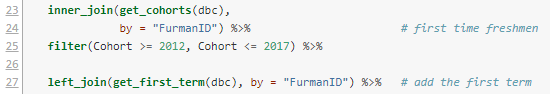
Lines 23-24 go back to the database using a convenience function we have in a custom package, to retrieve all students who are in our official first-time full-time freshmen cohorts. Since we want to understand sequential course-taking, it makes sense to exclude transfers and other sorts of students.

The most recent returning class (entering fall 2017) hasn't had two full years yet, so I excluded those in line 25. That leaves us cohorts 2012 through 2016 as data points.

Line 27 uses another custom function to add the start term to each student record. This is inefficient computationally, but easy to add here since I had the function handy. The start terms should all be the fall of their cohort year, and that would be another way to do it, using mutate() and paste().

Now we need to tweak the data a little.


The mutate() verb in dplyr lets you create new columns or change existing ones. Here, I use a custom function to compare the term each course was taken with the student's start term to find the time elapsed. This returns a number 1,2,3..., where 1 means first fall/spring term attended, and so on. There are a very few odd cases where it might turn out to be zero, so I round those up in line 30. 

We want to study courses taken early in a student's career, so any terms after 6 (end of junior year) I round down to 6. There aren't many cases like that, and it cleans up cluttered cases with small Ns.

Line 32 fixes a change in course prefixes that happened a couple of years ago, to make them match across time. 

Line 33 creates a Course variable by combining the subject and number, e.g. "BIO" and "101" turn into "BIO 101".

Finally, line 34 calculates the grade points assigned, where 4.0 = A, 3.0 = B, etc. 


Lines 36-38 look at the admissions data table and retrieve high school grade averages, which have been recalculated to be on a common 4-point scale. 

In the pre-R days, this data assembly probably would have taken me half a day. Now it just takes as long as writing the description and fixing typos and logical errors. Most importantly, the process is standardized and transparent. It runs in a few seconds, even through VPN. 

The result is about 57,000 data points, illustrating the comparison with formal assessment data. As someone once said, quantity has a quality of its own. 

The Research Data

Now that we have courses and grades, coupled with when students took the courses and their high school grades (to use as a predictor), we can narrow the data down to the courses that are the focus of the research. In this instance we only care about courses that are commonly taken by students in their first two years of college.


The filter in line 42 says we only care about the first two years. The next line counts total enrollment for each course and calls that count N_enroll. Line 44 sorts the list so it's easy to scan when printed out, and line 45 filters courses to those with at least 200 students enrolled. That list of courses is saved in a new data frame called popular_courses.

Lines 47-48 inner join the popular courses with the grades data, meaning only the courses in the former are now in the data set: 37 courses and 18,000 data points.

Correlations 

The first scan looks at the linear correlation between when a course was taken (a term number 1-6) and the grade points (0-4.0) for each student who took the course. This entails processing through each course, sub-setting those data points, computing correlations, and then assembling then. Again, this would have take me hours in the old days. Now it's just this:

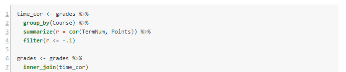
The script I'm using starts renumbering back at 1 for technical reasons. Lines 1-4 consider the data as grouped by Course, and for each one computes the correlation and stores it in a new variable r. Because we're interested in negative correlations (waiting to take the course associates with lower GPAs), I've filtered to correlations of -.1 or lower. 

Lines 6-7 filter our grade data to just these courses. Now there are seven courses and 3200 data points. Here are the results:


In posting this publicly, I've made the course names generic. They are all STEM or foreign language courses in this case.

Visualization

It's always a good idea to look at the data. Here are the per-term grade averages for the selected courses.

Figure 1. Grade averages by term taken.

I left off the error bars because they cluttered it up. In my first article, I suggested using the year the student took the class, but it's clear here that it's better to use the term number.

Notice the steep decline in Course 8 (pink) over three years. Some of the others, like Course 21 (red) have low GPAs, but they are consistently low.

Models

We've now identified some courses where waiting to take them might be detrimental to the student. Another possibility is that the students who wait to take these courses are less-prepared academically. To attempt to disambiguate the waiting effect from the selection effect, we can create a linear model for each course. The dependent variable is average GPA in the course, and the dependent variable is the time the course was taken (TermNum) and the high school grade average (HSGPA). 

Once again we have the challenge of looping over each subject and doing complex calculations, then assembling the results. The tidyverse R packages makes this easy.


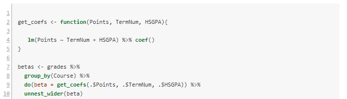
Lines 2-5 define a convenience function to build the requested linear model and extract its coefficients. Then we loop over each course with lines 7-8. Line 9 does the work of getting the coefficients. There are three of these, and the do() verb puts them in a list. The last line unpacks the list and turns them into three separate columns.


Notice that of the courses in the selection, number 8 still has a quite significant drop per term in GPA, even after factoring out high school grade averages.

The model for Course 8 has \(R^2 = .13\), which is similar to the correlation coefficient we got earlier (the square root of .13 is .36). It's small but not meaningless. Here are the model details.


Discussion

In the case of Course 8, it is usually taken in the second year, and the effect we see is mostly the difference between years two and three. On the graph, the high numbers for terms 1 and 2 are almost certainly a selection effect--only stellar students take the course that early. The year 2-3 drop raises interesting questions about advising, placement, and preparation. It would be a good idea to redo the analysis using first year college grades rather than high school grades, to see how much effect remains. 

Some of the other courses are worth following up with as well. I didn't include details of each in order to save space here. All in all, this is a successful bit of research that can help specific programs tune their student success pathways. 

If you try this method at your institution and find something interesting, please let me know.

I've had several people ask me for the code to do the grade reliability calculations. It needs some cleaning up before I can post it, but I will try to get it done this week. I want to build the functionality into our custom packages so I easily rerun it, and that takes a little longer than a one-off. 

Saturday, November 09, 2019

Using Grade Data for Improvement

Introduction

This article follows the theme of the last one, in taking a close look at course grade data and what it can tell us about student learning and success in college. I'll use a real example that you can replicate with your data and probably learn something useful.

You may be familiar with the idea of institutional effectiveness (IE), which advertises a decision-making process that comprises:
  1. setting goals relative to metrics,
  2. measuring suitable indicators of success,
  3. analyzing the data, and
  4. taking appropriate action.
I have gradually picked up on a pattern in human affairs that should have been obvious long ago: institutions choose the most convenient solutions to problems up to the point where being wrong is too painful (a less quotable version of Menchen's "there is always a well-known solution to every human problem—neat, plausible, and wrong"). 

Anne Applebaum's Red Famine describes how Bolshevik ideology led to collective farms, and kept the policies in place long after it was obvious that it was counterproductive. Luke Dittrich's Patient H.M. chronicles how many years it took to convince psycho-surgeons that they shouldn't routinely lobotomize their patients. And Siddhartha Mukherjee's The Emperor of  All Maladies describes how hard it was to uproot an erroneous theory about cancer to prevent the harm it was causing in radical surgery. 

The attraction of a good story dressed up as a theory is perhaps humanity's Achilles' heal. In the case of IE, there are several problems with the theory. This will all matter in a minute, so bear with me.

Analyzing Data

A couple of years ago I was preparing graphs of learning outcome ratings for departments like the one below, which I turned into a presentation slide.

Figure 1. Success rates in general education foreign language.


The graph is typical of what's seen in assessment reports, in alignment with the IE philosophy. Our nominal goal for general education outcomes like this was to have the "Doesn't meet expectations" rate under 10%. This one's too high by that standard. 

The problem is that, assuming we trust the data, we still don't know why students are not measuring up; we lack a causal model to explain the data. The usual advice from people who call themselves assessment experts is to extend the IE reductionism to look more closely at the work students are producing. This is one of those too-simple ideas, because it assumes that all learning problems are granular--that there's some subset of the material that is the problem, and if we just "add more problems to the syllabus" on that topic, we'll fix it. This constitutes the majority assessment "actions for improvement" that I see. 

Reality is more complicated than that. Quite by accident I made the graph below while mass-producing these for all our outcomes. Most are developmental, meaning we expect to see growth over four years, so for a threshold scale [doesn't meet/meets expectations], it isn't obviously useful to disaggregate the data by the student's year in college. 

Average success rates by when students take the course.

However, when we plot the rating averages this way, it's interesting. It looks like students who wait to take the introductory foreign language courses don't do as well in them. Is this because of the waiting time or a selection effect, where lesser-prepared students put off a hard class? A regression analysis suggests that both of these factors are involved. 

Grade Analysis

After I found the result above, it occurred to me that I could probably find the same pattern by looking at course grades, which I have a lot more of than assessment data. The analysis went like this:
  1. Get course grade data for the last several years and create a column that joins the subject and number, e.g. "Bio 101". We want grade points, not letters. You can either drop the Ws or turn them into zeros, as you like.
  2. Get a list of entering freshman cohorts and inner join to the grade data (i.e. keep only entering freshmen, because transfers will muddy the waters). 
  3. Identify the 100 or so most common courses taken and filter the data to those. These will include common general education courses and gateways for big majors. A big school would need more than 100 here, probably, to be sure to get everything interesting.
  4. For each of those courses, use the entering date of each student to add a column to the data that tells us what year in college he or she took each course. Our data columns now look like Course Type, StudentID, GradePoints, YearTaken. 
  5. For each course type, correlate GradePoints with YearTaken. (Alternatively, subtract the averages of year 1 grades from years 2+ average grades).
  6. Sort by largest negative correlations (or differences). 
When I did this, I got a list of courses that had math and sciences and foreign languages at the top. To take the next step, create linear models for each of these that has GradePoints as the dependent variable and YearTaken and High School GPA (or some other academic predictor like SAT/ACT) as independent variables. This should help sort out the selection question. 

Note: I am recoding this analysis for my data now, to organize the functionality into a reproducible research format. When I'm finished, I'll post the package on github so you can modify it for your own use. I'll post an update when that's done.

Getting to Action

My conclusion of the analysis on grades was that different advising could raise grades in the courses identified by getting students into them sooner. Notice that this is a long way from "adding another problem set on subject-verb agreement," which would be a likely outcome of only having figure 1 to consider. 

It seems very rare in institutional research to actually find a problem that can be clearly linked to a likely solution. When it does happen, the follow-up can be discouraging, because it's hard to change things. Machiavelli said it best in The Prince:

It ought to be remembered that there is nothing more difficult to take in hand, more perilous to conduct, or more uncertain in its success, than to take the lead in the introduction of a new order of things. Because the innovator has for enemies all those who have done well under the old conditions, and lukewarm defenders in those who may do well under the new. This coolness arises partly from fear of the opponents, who have the laws on their side, and partly from the incredulity of men, who do not readily believe in new things until they have had a long experience of them.
In this case, the solution is complicated, because it's not really just about advising. It's also about course capacity and agency of students. It's about institutional culture. 

My guess is that if you do this analysis yourself, you'll get similar findings. If you can then implement changes so that the most vulnerable students get into the risky classes earlier, with proper support, it could lift success rates, and--incidentally--additional revenue via retention. 

Discussion

The IE model has two simplifications illuminated in this article, that create critical weaknesses in the usefulness of the theory. The first is the implicit idea that just having some data is enough to identify a way to improve your situation. In reality, we have to have a way to use the data to predict what will happen in the future--a predictive model. That's difficult and often impossible, when we just don't know enough about the domain, or it's inherently random  (e.g. predicting the stock market is difficult despite all the data available, and weather forecasts more than a few days out are useless). 

The other oversimplification is the idea that people make data-driven decisions. Says Cassie Kozyrkov at Google "Businesses hire data scientists in droves to make rigorous, scientific, unbiased, data-driven decisions. And then they don't." This is one of several articles I've come across attempting to explain why data science often doesn't lead to different decision-making. It's a human problem, involving leadership style, psychology, and institutional culture. Stalin knew collectivization was leading to mass starvation, but the program was too associated with him to reverse. 

Some problems that Kozyrkov observes:
  • Many people only use data to feel better about decisions they’ve already made.
  • The more ways there are to slice the data, the more your analysis is a breeding ground for confirmation bias.
  • When decision-makers lack fundamental skills, there’s no math in the world that can fix it.
Another take on the same problem is found in an article by Jan Bosch here:
  • bad data,
  • wrong interpretation,
  • confirmation bias,
  • and the opposite: rejecting data that discredits a pet theory.
Jan closes with a subtle problem stemming from too much ambition, political necessity, and statistics:
Finally, when a company starts with a data-driven initiative, the initial focus is on a big, strategically important topic that has many contributing variables. The topic is selected in order to garner the necessary support. However, the first initiatives to use data with the intent to influence the strategic goal have too little power to move the needle on the measured output data. The effect of the input variables is too little to push the output variables outside the noise range. Therefore, the initiative is easily categorized as a failure as the effects were too small to influence the selected output variable with statistical significance. In effect, the initiative was set up for failure from the beginning.
In statistics, we do (or should do) a power analysis in the beginning, to see if the proposed data have enough statistical usefulness to give us an answer to the research question. Otherwise, we can do a lot of work to gather data and then get an inconclusive result even when the thing worked.

The lesson is that if you're serious about using numbers together with goals, the statistical models should be designed at the beginning with the metrics and goals. 

Which brings us to the most significant problem with the IE theory that I'll mention: many problems can't realistically be solved via statistical modeling. There are other kinds of leadership that are just as important, and the most effective leaders are those who can make good decisions with only poor information. How that's possible will have to wait for another day.