First, I should say that goo may not be totally useless. The gold standard of utility is often predictive validity. Grades are goo, for example, but still have some predictive power. High school grades can predict university grades to explain perhaps 20% of the variance in the first year college GPA. And first year grades can predict the whole college career fairly well. But you have to tease out the statistical effects from the real effects (where "real" means in the sense of the physical universe and not just a numerical artifact).
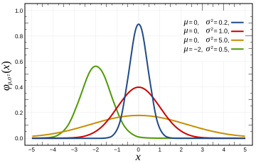
It is easy to imagine that if your data has a normal distribution (bell curve, or Gaussian), that this means something profound. The utility of the bell curve comes from the fact that this is how averages of random variables tend to distribute themselves. The graph below is courtesy of Wikipedia.
 It's easy to fool oneself, and as a bonus fool others. See the graph below, showing nine groups of students, divided up by their first year college grade average. The graph tracks what happens over time to each group's cumulative GPA.
 Imagine turning this graph loose with a planning committee. Obviously something dramatic is happening in the second year because the distribution becomes much tighter. What could it be? The discussion could easily turn to advising programs, analysis of course completion, data mining on demographics or other information, and so forth. There's nothing wrong with those efforts, it's just that the graph doesn't really support them. You might want to take a moment to puzzle out why that is for yourself.
The central limit theorem is the formal way of talking about distributions of averages in a pretty general context. And it says that as sample sizes increase, variances (and hence standard deviations) decrease. What happens between the first and second years of accumulated GPA? There are twice as many grades! Hence we would expect the variation to decrease. Another way of thinking of it is as a combinatorial problem. If you are a 4.0 student, there is only one way to maintain that average: get all As the second year. On the other hand, there are lots of ways to decrease your average: any combination of grades that is not all As (there are 3,124 of those).
We must conclude that the GPA compression that's apparent in the graph is mostly due to a statistical artifact (we would check actual variances to quantify this), and not due to some real world parameter like student abilities or difficulty of the curriculum.
Another fallacy easily derived from the graph above is that the poorer students do better over time because of their GPA correlation with the year. We've already dispensed with that by means of the central limit theorem, but there are other factors at play too--the slope of the graph is sharpest at the bottom. Everybody knows that correlation doesn't imply cause. The Church of the Flying Spaghetti Monster, for example, holds that global warming has been caused by the rise in worldwide piracy.

After some musing, you might conclude that the poor performers' GPAs improved because of dropouts. It's simply not possible to maintain a 1.0 GPA for long, so the lower group averages would rise because of survivorship. Not controlling for survivorship invalidates a lot of conclusions about learning. It's common practice not to do so, however, because it requires a cohort years to cycle through the university's digestive system.
Avoid averages if you can. It's very easy to make goo. I've argued that when we assess learning, we are trying to put a ruler to inherently qualitative information. I mean by that information that has a lot of dimensions, and which we deal with routinely using our complex on-board wetware without thinking about it too much. When we average, it's like melting down a bronze sculpture and weighing the slag.
If you're stuck with averages, don't take the meaning of the resulting goo too seriously. You'll at least very likely have a nice bell curve distribution to work with. But don't imagine that the mean value equates to some real world assessment used in common language like intelligence, or effective writing, or critical thinking. In order to make that kind of connection, one has to build the bridge from both directions. What is the common perception of a student's work? How does it relate to the goo? In my experience, you can find reasonable correlations between the two, but if the "critical thinking" test correlates highly with natural language subjective assessments of critical thinking, it is still just a correlation, not a measurement. As such it can be very useful, but we should be careful how we talk about it.


I'm fairly new to assessment (from a quantitative social science background), and this blog is just about the only thing that helps me retain my sanity. Ed research is full of enormous claims based on tiny (but statistically significant!) results. For example, almost anything about the NSSE makes me want to rip my hair out.
ReplyDeleteThank you for giving me something to read that preserves my scalp.
Thanks for the note, Matt. I know what you mean. It's very difficult to sort through the hyperbole. Unfortunately, there are often high stakes (like accreditation) riding on the superficial correctness of one's approach.
ReplyDelete