If you're not familiar with the OKCupid blog, check out it out here. Christian Rudder slices and dices data from the dating site to try to reveal human nature. I find it great fun to follow along with his train of thought, which he presents engagingly and well-illustrated with graphics. The articles could serve as examples to students of what 'critical thinking' might be.
The report linked above is particularly interesting because it addresses ethical issues. If you look at the comments, you'll see a range of reactions from "that's cool" to "how dare you!", include a couple by putative psychology researchers who mention IRB processes. This comes on the heals of Facebook's research on manipulating attitudes, and the resulting media fiasco.
This is a looming problem for us in higher education, too. As an example, imagine a software application that tracks students on campus by using the wi-fi network's access points and connections to cellphones. This could be used to identify student behaviors that are predictive of academic performance and retention (e.g. class attendance, social activity). Whereas a manual roll-taking in class is an accepted method of monitoring student behavior, cellphone tracking crosses a line into creepy. The only way to proceed with such a project would be transparently, in my opinion, which could be done with an opt-in program. In such a program, students would be given a description and opportunity to sign up. In return, they receive information back, probably both the detailed information that is being gathered as well as summary reports on the project. I have been looking for examples of colleges taking this approach. If you know of one, please let me know!
See also: "okcupid is the new facebook? more on the politics of algorithmic manipulation" at scatterplot.com.
Showing posts with label data mining. Show all posts
Showing posts with label data mining. Show all posts
Tuesday, July 29, 2014
Sunday, July 27, 2014
Survey Prospector
(last updated 5/30/2015)
Survey Prospector is a web-based interface for quickly exploring discrete data. It is intended to support a "want-know-do" cycle of intelligent action. It allows you to quickly execute a predictor-finding workflow to try to find potential cause/effect relationships you care about.
Workflow:
Here's a video tour using a 45M CIRP national data set. You can do something similar with a small sample by downloading these files:
Screenshots
This is the main tab, where the predictors are sorted and displayed in order of importance.


Survey Prospector is a web-based interface for quickly exploring discrete data. It is intended to support a "want-know-do" cycle of intelligent action. It allows you to quickly execute a predictor-finding workflow to try to find potential cause/effect relationships you care about.
Workflow:
- Normalize scalar or nominal data into bins or small numbers of categories if necessary.
- Apply any filters of interest (e.g. just males or just females).
- Identify a target (dependent) variable and create a binary classification.
- List the independent variables in decreasing order of predictive power over the dependent variable, with graphs and suitable statistics automatically generated.
- Browse these top predictors to get a sense of what is important, including linear and non-linear relationships between pairs of them.
- Visually inspect correlational maps between the most important independent variables.
- Create multivariate predictors using combinations of the best individual predictors.
- Cross-validate the model by keeping some data back to test the predictor on.
- Assign modeled probabilities to cases, e.g. to predict attrition.
This all happens in real time, so that this can be used in meetings to answer questions if you like. A common malady of IR offices is that it's much easier to ask questions than to answer them. This tool can be used to effectively prioritize research. It lends itself to data warehousing, where you might build a longitudinal history of student data across a spectrum of types. Then it becomes trivial to ask and answer questions on the fly like "what student non-cognitives predict good grades their first semester?" or "what's the effect of work-study on first year attrition?"
Here is the application: Survey Prospector v2-1-15 [Note: if the online app doesn't work, it's because my hourly limit for the month has been reached.]. A video demo can be found here, using this data set. If you need a primer on predictors and ROC curves, try this.
Here's a video tour using a 45M CIRP national data set. You can do something similar with a small sample by downloading these files:
- CIRP1999sample.csv a random sample of 401 rows taken from the 38,844 in HERI's 1999 CIRP survey data set
- CIRPvars.csv, an index to the items and responses
Technical details. If you want to try this on your own data, please don't upload anything with student identifiers or other sensitive information. The data should be in this format:
- Data files need a header row with variable names.
- Index files do not have a header. They are just a variable name, a comma, and the description without commas. Only one comma per line unless you want to put the description in quotes. Index files are optional, but they help decipher results later on. Download the example CIRPvars.csv listed above to see one.
Screenshots
This is the main tab, where the predictors are sorted and displayed in order of importance.

The graphs show the data distribution (with case types in blue or pink), a ROC curve for assessing predictor power, ratios with confidence intervals to assess statistical significance, and a table with case numbers and ratios in order to identify useful thresholds.

The screen capture above shows a dynamic exploration of the correlations between best predictors (red lines are negative correlations). The sliders at the top allow for coarse- or fine-grain inspection of variables. This allows you to see how predictors cluster visually. In researching attrition, this technique easily allowed identification of major categories of risk evident in our data: academic, financial, social engagement, and psychological.
Please leave feedback below or email me at deubanks.office@gmail.com.
Sunday, January 27, 2013
Finding Meaning in Data, Part II
In Part I, we took a look at a large data set from the perspective of trying to predict something. The example was artificial--there's no need to predict first generation status because it's easy to directly determine--but the survey items that link to that status tell us something about those students. So I'm using 'prediction' as a generic term to mean connections within a data set, and not necessarily chronologically.
But often we do want to make predictions of the future based on past information (inductive reasoning). I'll give an example below that expands on the first article by directly involving more than one predictor.
Here's a mock data set small enough to understand in full:
 We want to predict graduation from the data we have at hand. Using the single-dimension predictors, the best one is Athlete status:

At this point, we could research this by interviewing students or others, or looking for more data. Or we can try to mine the available data further by involving more than one variable. In Part I, I used RapidMiner to do that for me, and that's a good option. Decision trees are particularly easy to understand and implement.
One of the key ideas in some of the standard models is conditional probability, meaning that if we restrict our attention to a subset of the whole data set, we may get better results for that subset. More discussion on the philosophy behind this will come in the next installment. For now, I'll use our sample data as an example.
Let's go 'meta', and ask about the predictors themselves, and in particular the Athlete flag, which accurately predicts 12 out of 16 cases now. Let's ask: can we predict when the Athlete flag works and when it doesn't? This is the same kind of problem that we're already working on, just asked at a higher level. Instead of asking which variables predict graduation, we want to ask which variables predict how well the Athlete flag works.
To do that, we can create an indicator column that has a 1 in it if the Athlete column accurately predicts graduation, and a zero if it doesn't. Here's what that looks like:
 I've highlighted the cases where the Athlete flag == Graduation flag, and those cases have a 1 appearing in the new AthInd indicator column. Now we run the predictor algorithm to see what predicts success, and come up with:

We find that Gender is a good indicator of the success of Athlete as a predictor, and in particular, when Gender==0, it's a perfect predictor. So now we know that in this data set we can perfectly predict Graduation by using Athlete for all cases where Gender==0.
A simpler approach is to turn the problem around and imagine that the best 1-D predictor can become a conditional for another of the variables. In this case, we'd run our prediction process with the filter Athlete==1, and we find that Gender conditioned on athlete works just as well as the other way around: we can predict 100% of the graduates for Gender==0. This business of conditionals may seem murky, given this brief description. I will address it more fully in the next installment.
Real data is not as clean as the example. Picking up from the update in the first post, one of the indicators of high GPA as a college senior (in 1999) is RATE01_TFS--academic self-confidence as a freshman. If a student ranked himself/herself in the highest 10%, there's a 51% chance he/she will finish with (self-reported) A average grades. Using the easy method described above, we can condition on this case (RATE01_TFS==5) and see what the best predictors of that set are. Within this restricted set of cases, we find that the items below predict A students to the level shown:
All of these improve on the initial accuracy of 51%, but at the cost of reducing the applicable pool of cases into smaller chunks.
With three questions from the freshman survey, we have found a way to correctly classify 79% of a subset of students into A/not A (lots of fine print here, including the assumption that they stay at the school long enough to become a senior, etc.). Here's the performance:

This is great. However, we have narrowed the scope from the original 5500 cases of A-students to about 800 by conditioning on the two items above (only one of the two had to be true: being well off financially being not important OR anticipating being elected to an academic honor society). However, this is not a bad thing--it gets us away from the notion that all A students are alike, and starts us on the path of discriminating different types. Note that to have confidence that we haven't "overfit" the data, the results need to be validated by testing the model against another year's data.
But often we do want to make predictions of the future based on past information (inductive reasoning). I'll give an example below that expands on the first article by directly involving more than one predictor.
Here's a mock data set small enough to understand in full:


At this point, we could research this by interviewing students or others, or looking for more data. Or we can try to mine the available data further by involving more than one variable. In Part I, I used RapidMiner to do that for me, and that's a good option. Decision trees are particularly easy to understand and implement.
One of the key ideas in some of the standard models is conditional probability, meaning that if we restrict our attention to a subset of the whole data set, we may get better results for that subset. More discussion on the philosophy behind this will come in the next installment. For now, I'll use our sample data as an example.
Let's go 'meta', and ask about the predictors themselves, and in particular the Athlete flag, which accurately predicts 12 out of 16 cases now. Let's ask: can we predict when the Athlete flag works and when it doesn't? This is the same kind of problem that we're already working on, just asked at a higher level. Instead of asking which variables predict graduation, we want to ask which variables predict how well the Athlete flag works.
To do that, we can create an indicator column that has a 1 in it if the Athlete column accurately predicts graduation, and a zero if it doesn't. Here's what that looks like:


We find that Gender is a good indicator of the success of Athlete as a predictor, and in particular, when Gender==0, it's a perfect predictor. So now we know that in this data set we can perfectly predict Graduation by using Athlete for all cases where Gender==0.
A simpler approach is to turn the problem around and imagine that the best 1-D predictor can become a conditional for another of the variables. In this case, we'd run our prediction process with the filter Athlete==1, and we find that Gender conditioned on athlete works just as well as the other way around: we can predict 100% of the graduates for Gender==0. This business of conditionals may seem murky, given this brief description. I will address it more fully in the next installment.
Real data is not as clean as the example. Picking up from the update in the first post, one of the indicators of high GPA as a college senior (in 1999) is RATE01_TFS--academic self-confidence as a freshman. If a student ranked himself/herself in the highest 10%, there's a 51% chance he/she will finish with (self-reported) A average grades. Using the easy method described above, we can condition on this case (RATE01_TFS==5) and see what the best predictors of that set are. Within this restricted set of cases, we find that the items below predict A students to the level shown:
- Took honors course: 74%
- Goal: Being very well off financially: not important: 70% (answered as a freshman)
- Goal: Being very well off financially: not important: 70% (answered as a senior)
- Never overslept to miss class or appointment: 69%
- Never failed to complete homework on time: 69%
- Very satisfied with amount of contact with faculty: 68%
- Less than an hour of week partying: 66%
- Self Rating: Drive to achieve (highest 10%): 65%
- Faculty Provide: Encouragement to pursue graduate/professional school: 64%
- Future Act: Be elected to an academic honor society: 64% (answered as a freshman)
- Goal: Being successful in a business of my own (not important): 63%
All of these improve on the initial accuracy of 51%, but at the cost of reducing the applicable pool of cases into smaller chunks.
With three questions from the freshman survey, we have found a way to correctly classify 79% of a subset of students into A/not A (lots of fine print here, including the assumption that they stay at the school long enough to become a senior, etc.). Here's the performance:

This is great. However, we have narrowed the scope from the original 5500 cases of A-students to about 800 by conditioning on the two items above (only one of the two had to be true: being well off financially being not important OR anticipating being elected to an academic honor society). However, this is not a bad thing--it gets us away from the notion that all A students are alike, and starts us on the path of discriminating different types. Note that to have confidence that we haven't "overfit" the data, the results need to be validated by testing the model against another year's data.
Saturday, January 26, 2013
Finding Meaning in Data, Part I
Large data sets can be heartbreaking. You suspect that there's something in there--something really useful--maybe even a "knock it out of the park" bit of wisdom, but finding it is often not trivial. The Scylla and Charybdis in this classical tale are (*) wasting an inordinate amount of time to find nothing, or (@) trying too hard and bestowing confidence on something meaningless. The perils are everywhere. At one point, I had myself convinced I'd found a powerful predictor of attrition: students who didn't have financial aid packages. After chasing down that rabbit hole for too long, I discovered that the connection was real, but in the wrong direction: students who left had their packages scrubbed from the system (an argument for data warehousing).
Yesterday I happened across an article about the disadvantages first-generation students face in college:
The nice folks at HERI allow access to old survey data without much fuss, and I downloaded the Senior Survey results from their data archive to use for a demonstration. The survey is high quality and there are lots of samples. I limited myself to results from 1999, about 40K cases, of which somewhat more than half are flagged as not being in the 2-year college comparison group.
This is an item on the survey:
FIRSTGEN_TFS First generation status based on parent(s) with less than 'some college'
Continued in Part II
The only solution, I think, is to make it easier to find interesting connections, and easier to know if they are real or spurious. To that end, I've strung together a Rube Goldberg contraption that looks for interestingness and reports it in rank order, interestingest on top. There's quite a bit to say about the hows and whys, but let me start with an example.
Yesterday I happened across an article about the disadvantages first-generation students face in college:
Given ... the ways in which students’ social class backgrounds shape their motives for attending college, we questioned whether universities provide students from these different backgrounds with an equal chance of success. — Assistant Professor Nicole StephensAnd if you're interested in that, there's a recent article in the Atlantic "Why Smart Poor Students Don't Apply to Selective Colleges [...]"
[T]he majority of these smart poor students don't apply to any selective college or university, according to a new paper by Caroline M. Hoxby and Christopher Avery -- even though the most selective schools would actually cost them less, after counting financial aid. Poor students with practically the same grades as their richer classmates are 75 percent less likely to apply to selective colleges.Now 'poor' and 'first generation' are not the same thing, but they overlap substantially. We can test that by looking at some data (albeit old data).
The nice folks at HERI allow access to old survey data without much fuss, and I downloaded the Senior Survey results from their data archive to use for a demonstration. The survey is high quality and there are lots of samples. I limited myself to results from 1999, about 40K cases, of which somewhat more than half are flagged as not being in the 2-year college comparison group.
This is an item on the survey:
- (1) No
- (2) Yes
Wouldn't it be interesting to know how the other items on the survey relate to this one? My old approach would have been to load it up in SPSS and create a massive correlation table. Later I figured out how to graph and filter the results, but there are problems with this approach that I'll cover later.
Now, within about a minute I have a full report of what significant links there are, answering a specific question: if I had the whole survey except for this FIRSTGEN_TFS column, how well could I predict who was first generation? Here's the answer.

The value of a classifier like this is sometimes rated by the area under the curve (AUC) when drawing true positive rate versus false positive rate--a so-called ROC curve. That's the left-most graph above the table we were just looking at. The next one to the right shows where the two rates meet (slightly to the left of 3), which defines the cut-off for the classifier. The histogram to the right of that shows the frequency of responses, with blue being the first-gen-students and red the others. The final graph in that series gives the fraction of first-gen students who responded with 4,3,2,1 for this item, so if we chose a student who responded (4) to this item, there's a 19% chance that they were first generation, as opposed to a 9% chance if they responded (1).
Note that even though this is not a great predictor, we can have some confidence that it's meaningful because of the way the responses line up: 4,3,2,1. These are not required to be in order by the program that produces the report. Rather, the order is determined by the usefulness of the response as a predictor, sorted from highest to lowest. As a result, the In-Class fraction graph always shows higher values on the left.
The table at the very top shows the true positive and false positive rates (here, In-class means the group we have selected to contrast: students who checked the first-gen box in this case). The number of samples in each case is given underneath, and a one-tailed p-value for the difference of proportions is shown at the bottom, color coded for easy identification of anything less than .05.
You can download the whole report here.
We can take the whole list of good predictors and generate a table of predictions from each. These are each one-dimension, like the question above about the likelihood of needing a job while in college. We can see how these overlap by mapping out their correlations. That's what the graph below shows (down to correlation +/-.40).

The good news is that there are no negative correlations (predictors that contradict one another). The items cluster in fairly obvious ways and suggest how we might pare down the list for further consideration.
In order to create multi-dimensional models, we can try using standard machine learning algorithms using RapidMiner or Weka, which are free. An example using the former is shown below, employing a Bayesian learning algorithm to try to sort out the difference between first generation students and the others using the one-dimensional predictions already generated.

The result is a classifier that has usable accuracy. In the table below, first generation students (as self-reported on the survey) are coded as 1.

Now, within about a minute I have a full report of what significant links there are, answering a specific question: if I had the whole survey except for this FIRSTGEN_TFS column, how well could I predict who was first generation? Here's the answer.
- (.95) Father's education level is lower
- (.94) Mother's educational level is lower
- (.63) Distance from school to home is lower
- (.63) Get more PELL grant money
- (.61) More concerns about financing college education
- (.60) Less likely to communicate via email with family
- (.60) Financial assistance was more important in choice to attend
- (.59) Don't use computers as often
- (.59) Lower self-evaluation of academic ability as a Freshman (less true as a senior)
- (.58) Wanted to stay near home
- (.57) Are more likely to work full time while attending
- (.57) Are less likely to discuss politics
- (.57) Are less likely to have been a guest at a professor's home
- (.57) Spend more time commuting
- (.57) Are more likely to speak a language other than English at home.
- (.57) Evaluate their own writing skills lower
- (.57) Low tuition was more important in choice to attend
- (.56) Have a goal of being very well off financially.
- (.56) Had lower (self-reported) college grade average
This list goes on for pages. The numbers in parentheses are a measure of predictive power, the AUC which will be described in a bit. Obviously mother and father's educational level are linked to the definition of first-generation student, but the others are not.
We can see in this list a clear concern, even back in 1999, about finances. There's also a hint that these students are not as savvy consumers as their higher-SES peers: the desire to stay close to home, for example. We could follow up by explicitly chasing ideas. What's the profile of high-GPA first generation students? Does gender make a difference? And so on. These are easily done until the point where we don't have much data left (you can only disaggregate so far).
Rather than doing that, let me show the details of this automated survey analysis. Each of these items on the list above comes with a full report, one of which is reproduced below.

This is a lot to take in. For the moment, focus on the table near the bottom called "Predictor Performance." If we just used the response to this item about the likelihood of having to get a job to pay for college, the predictor works by classifying anyone who responds with (4) Very good chance or (3) Some chance as a likely first-generation student. This would result in correct classification of 86% of the first generation students (true positives), diluted by 89% (from 1-.18) of the non-first-generation students (false positives). This is not a great predictor by itself, but it's useful information to know when recruiting and advising these students.
The value of a classifier like this is sometimes rated by the area under the curve (AUC) when drawing true positive rate versus false positive rate--a so-called ROC curve. That's the left-most graph above the table we were just looking at. The next one to the right shows where the two rates meet (slightly to the left of 3), which defines the cut-off for the classifier. The histogram to the right of that shows the frequency of responses, with blue being the first-gen-students and red the others. The final graph in that series gives the fraction of first-gen students who responded with 4,3,2,1 for this item, so if we chose a student who responded (4) to this item, there's a 19% chance that they were first generation, as opposed to a 9% chance if they responded (1).
Note that even though this is not a great predictor, we can have some confidence that it's meaningful because of the way the responses line up: 4,3,2,1. These are not required to be in order by the program that produces the report. Rather, the order is determined by the usefulness of the response as a predictor, sorted from highest to lowest. As a result, the In-Class fraction graph always shows higher values on the left.
The table at the very top shows the true positive and false positive rates (here, In-class means the group we have selected to contrast: students who checked the first-gen box in this case). The number of samples in each case is given underneath, and a one-tailed p-value for the difference of proportions is shown at the bottom, color coded for easy identification of anything less than .05.
You can download the whole report here.
We can take the whole list of good predictors and generate a table of predictions from each. These are each one-dimension, like the question above about the likelihood of needing a job while in college. We can see how these overlap by mapping out their correlations. That's what the graph below shows (down to correlation +/-.40).

The good news is that there are no negative correlations (predictors that contradict one another). The items cluster in fairly obvious ways and suggest how we might pare down the list for further consideration.
In order to create multi-dimensional models, we can try using standard machine learning algorithms using RapidMiner or Weka, which are free. An example using the former is shown below, employing a Bayesian learning algorithm to try to sort out the difference between first generation students and the others using the one-dimensional predictions already generated.


The model correctly classifies 15,219 non-first-gen students and 2,300 first gen students, and incorrectly classifies a total of 6,259 cases. This is better performance than any of the single predictors we found (leaving out parental education level, which is hardly fair to use). The AUC for this model is .76.
Note that this is only part of the work required. Ideally we create the model using one set of data, and test it with another. For example, we could use 1998 data to predict 1999 data.
This general approach can be used to predict enrollment, retention, academic success, and anything else you have good data on. There's much more to this, which is why the title has "Part 1" in it. Stay tuned...
Update: As another example, I contrasted students who report having an A average in their senior year to those who don't (for 4-year programs), and eliminated those in the B+/A- range to make the distinction less fuzzy. You can see the whole report on one-dimensional predictors here.
You'll see things you expect, like high academic confidence, and good study habits (not missing class, turning homework in on time), but there's also a clear link to less drinking and partying, intellectual curiosity (e.g. taking interdisciplinary courses), the role of professors as mentors and role models (e.g. being a guest in a professor's home), a trend toward helping others through tutoring and service learning, but the one that surprised me the most is shown below. It's an item that is asked on the freshman survey and repeated on this senior survey. They give virtually identical results:

This is matched by a question about having a successful business, with similar results. Both show a clear tendency of the top grade earners to not be as motivated by money as students who get Bs or below (remember, this is 1999).Note that this is only part of the work required. Ideally we create the model using one set of data, and test it with another. For example, we could use 1998 data to predict 1999 data.
This general approach can be used to predict enrollment, retention, academic success, and anything else you have good data on. There's much more to this, which is why the title has "Part 1" in it. Stay tuned...
Update: As another example, I contrasted students who report having an A average in their senior year to those who don't (for 4-year programs), and eliminated those in the B+/A- range to make the distinction less fuzzy. You can see the whole report on one-dimensional predictors here.
You'll see things you expect, like high academic confidence, and good study habits (not missing class, turning homework in on time), but there's also a clear link to less drinking and partying, intellectual curiosity (e.g. taking interdisciplinary courses), the role of professors as mentors and role models (e.g. being a guest in a professor's home), a trend toward helping others through tutoring and service learning, but the one that surprised me the most is shown below. It's an item that is asked on the freshman survey and repeated on this senior survey. They give virtually identical results:

Continued in Part II
Friday, December 16, 2011
Free Hypothesis-Generating Software
In the last year there have been announcements of two free software packages that use machine learning techniques to mine data for relationships. The resulting mathematical formulas can be used to form hypotheses about the underlying phenomena (i.e. whatever the data represents).
The first one I have mentioned before. It's Eureqa from Cornell, which uses symbolic regression. There is an example on the Eureqa site that poses this sample problem:
There is a limitation to genetic programming that is also a threat to any intelligent endeavor: the problem may not be amenable to evolutionary strategies. There are some problems where the only way to solve them is exhaustive search. Only if the solution space is "smooth" in the sense that good solutions are "near" almost-good solutions is the genetic approach going to find solutions faster than exhaustive search. On a philosophical note, modern successes with physical sciences suggest that the universe is kind to us in this regard. The "unreasonable effectiveness" of mathematics (the title of an article by Eugene Wigner) in producing formulas that model real world physics is a hopeful sign that we may be able to decode the external environment so that we can predict it before it kills us. (The internal organization of complex systems is another matter, and there's not much success to look to there.). Note, however, that even here formulas have not really been evolutionary, but revolutionary. The formulation of Newton's laws of motion are derivable from Einstein's relativity, but not vice versa. The "minor tweak" approach doesn't work very often, Einstein's Cosmological Constant notwithstanding.
The first one I have mentioned before. It's Eureqa from Cornell, which uses symbolic regression. There is an example on the Eureqa site that poses this sample problem:
This page describes an illustrative run of genetic programming in which the goal is to automatically create a computer program whose output is equal to the values of the quadratic polynomial x2+x+1 in the range from –1 to +1. That is, the goal is to automatically create a computer program that matches certain numerical data. This process is sometimes called system identification or symbolic regression.The program proceeds as an evolutionary search. The graph pictured below is a schematic of the way the topology of the evolved "critters" is formed.
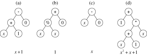 |
| A family tree of mathematical functions. (Image Source: geneticprogramming.com) |
The second data miner is aptly called MINE, and comes from the Broad Institute of Harvard and MIT. You can read about it on their site broadinstitute.org. The actual program is hosted at exploredata.net, where you can download a java implementation with an R interface. Here's a description from the site:
One way of beginning to explore a many-dimensional dataset is to calculate some measure of dependence for each pair of variables, rank the pairs by their scores, and examine the top-scoring pairs. For this strategy to work, the statistic used to measure dependence should have the following two heuristic properties.
Generality: with sufficient sample size the statistic should capture a wide range of interesting associations, not limited to specific function types (such as linear, exponential, or periodic), or even to all functional relationships.
Equitability: the statistic should give similar scores to equally noisy relationships of different types. For instance, a linear relationship with an R2 of 0.80 should receive approximately the same score as a sinusoidal relationship with an R2 of 0.80.
It's interesting that this is a generalized approach to my correlation mapper software, the difference being that I have only considered linear relationships. For survey data, it's probably not useful to look beyond linear relationships, but I look forward to trying the package out to see what pops up. It looks easy to install and run, and I can plug it into my Perl script to automatically produce output that complements my existing methods. A project for Christmas break, which is coming up fast.
Update: I came across an article at RealClimate.org that illustrates the danger of models without explanations. Providing a correlation between items, or a more sophisticated pattern based on Fourier analysis or the like, isn't a substitute for a credible explanatory mechanism. Take a look at the article and comments for more.
By coincidence, I am reading Emanaul Derman's book Models.Behaving.Badly: Why Confusing Illusion with Reality Can Lead to Disaster, on Wall Street and in Life. It has technical parts, which I find quite interesting, and more philosophical parts that leave me scratching my head. The last chapter, which I haven't read yet, advertises "How to cope with the inadequacies of models, via ethics and pragmatism." Stay tuned...
Update 2: You can read technical information about MINE in this article and supplementary material.
Subscribe to:
Posts (Atom)
-
In 1981 , Reagan's Secretary of Education commissioned a report that became the 1983 A Nation at Risk: the Imperative for Educational Re...
-
 The annual NACUBO report on tuition discounts was covered in Inside Higher Ed back in April, including a figure showing historical rates. (...
 -
I was going to entitle this piece "critical thinking squared" as a cute way to imply critical thinking about critical thinking, b...
-
 I just came across a 2007 article by Daniel T. Willingham " Critical Thinking: Why is it so hard to teach? " Critical thinking is ...
 -
 Inside Higher Ed today has a piece on " The Rise of Edupunk ." I didn't find much new in the article, except that perhaps mai...
 -
 (A parable for academic workers and those who direct their activities) by David W. Kammler, Professor Mathematics Department Southern Illino...
 -
In the spring we took the plunge and converted our end-of-term student evaluations from paper to electronic. We used the identical form othe...
-
 There was a question on the ASSESS email list about evaluating grade distributions for courses. It's an interesting topic, and I dug out...
 -
 Introduction Stephen Jay Gould promoted the idea of non-overlaping magisteria , or ways of knowing the world that can be separated into mutu...
 -
 Introduction Within the world of educational assessment, rubrics play a large role in the attempt to turn student learning into numbers. ...

