Introduction
We all develop an intuitive sense of cause and effect in order to navigate the world. It turns out that formalizing exactly what "cause" means is complicated, and I think it's fair to say that there is not complete consensus. A few years ago, I played around with the simplest possible version of cause/effect to produce "Causal Interfaces," a project I'm still working on when I have time. For background I did a fair amount of reading in the philosophy of causality, but that wasn't very helpful. The most interesting work done in the field comes from Judea Pearl, and in particular I recommend his recent The Book of Why, which is a non-technical introduction to the key concepts.
One important question for this area of research is: how much can we say about causality from observational data? That is, without doing an experiment?
Causal Graphs
The primary conceptual aid in both philosophy and in Pearl's work is a diagram with circles and arrows--called a "graph" in math, despite the confusion this can cause. In particular, these are Directed Acyclic Graphs (DAGs), where a-cyclic means the arrows can't be followed to arrive back at your starting point (no cycles). This encompasses a large variety of types of problems we are interested in, including confounding scenarios.
If you want a quick primer on this subject, take a look at Fabian Dablander's "An introduction to causal inference." He does an excellent job at describing a hierarchy of knowledge about systems: look, do, imagine, which we could rephrase as observe, experiment, model.
Application
In the comments to Fabian's article there's a reference to an R package that calculates generalized (i.e. non-linear) correlation coefficients, which looks interesting but complicated. I found another R package called calg, which directly addresses the graph operations that are integral to Pearl's theory.
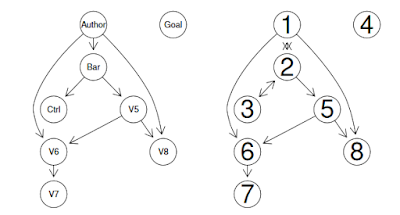
The image below comes from page 17 of the linked documentation. It's the result of simulating data with known properties, and then asking the algorithm to uncover the properties.
From calg documentation: left is the true model, right is the one discovered by the causal analysis
The diagram shows an example of the algorithms inducing the most likely causal structure when only given observational data. We can see that the structure is correct, but not all the arrow directions are discoverable from the data set (e.g. between 2 and 3).
This is fascinating stuff, and I look forward to trying it out on, say, retention analysis.


Your artical is nice.Everybody wants to make money online from home but most of the way is fraud or scam. They only want money but they didn't give any work. So everybody thinks that all the online jobs are false. But I want to say that all the ways of money-making are not false. You need the right way to make money online from home.
ReplyDelete