Here's a small part of a spreadsheet downloaded from the database, to illustrate.
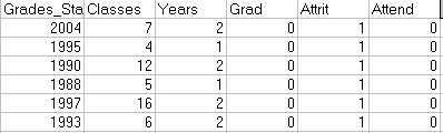
The year is the first (calendar) year that the student got a grade. All of the students shown left before graduation.
There are lots of other data columns, including financial aid, GPA, and the like. You can obviously add what's important to you. Once the data set is ready in Excel, click Data->PivotTable. If you haven't run one of these before, go learn how. Create a chart that uses Grad, Attrit, and Attend as data items and set the field properties to Average, using the Percent display option. Drag the start year over to the left, and you should create something like this:
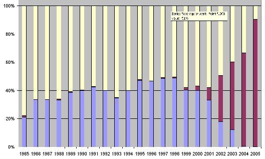
You can sort the data columns however you like. The one above shows graduates in blue, non-returners in yellow, and students still in attendence in magenta. This latter band widens out on the right because those are recent enrollees. The year of the 'class' appears at the bottom.
Once the chart is up and running, you can use page selects or other options to narrow the scope of samples to a particular major or student demographic. You can also see side-by-side comparisons for males and females, for example.
I create two of these charts. One shows percentages, like the one above. The other shows absolute numbers of students so you can see total enrollment for the group selected.


No comments:
Post a Comment